Decorating a home is difficult, and without a bit of research and some trustworthy second opinions, it’s easy to make some questionable decisions. Interior design trends are tough to gauge, and getting too comfortable with outdated furniture and styles you’re used to is easy.

ADVERTISEMENT - CONTINUE BELOW
Unfortunately, most people can’t keep up with what’s in, and allow their homes to become a smorgasbord of random comforting and eclectic items, rather than a practical, accessible, and stylish space. As we grow older, we struggle to stay up with the times, but seriously, do everything you can to avoid these callous decorating blunders most people make as they age.
Linoleum Flooring

ADVERTISEMENT - CONTINUE BELOW
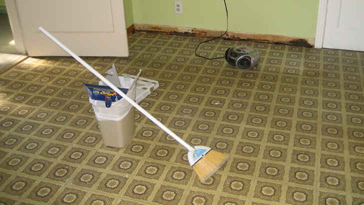
In this day and age, there’s just no way linoleum flooring will look good. Not only because it’s outdated, but because it’s cheap, distracting, and the material is creaky. Don’t be lazy and go for nicer tiles or true wood floors to save yourself the burden. You’ll thank yourself later.
Gold Frames

ADVERTISEMENT - CONTINUE BELOW
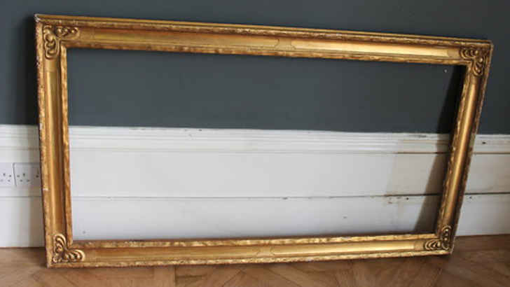
Hanging everything on the walls in a gold frame is a good way to say, “I want my home to look antiquated.” Sure, we get that the vintage, tarnished look may be appealing on its face, but having this mandate your style around the house just shows you’re unwilling to embrace modernity.
Popcorn Ceilings

ADVERTISEMENT - CONTINUE BELOW
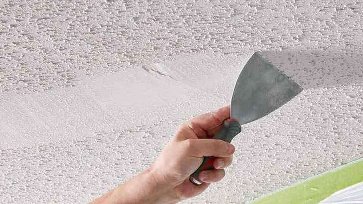
Textured ceilings are just a turn-off from the beginning, as they cause messes, give false senses of darkness and height, and collect dust. Just looking at popcorn ceilings causes a sense of unrest, and you almost want to shave it all off right then and there. Do your part by not allowing this style to stick around any longer.
China Cabinets

ADVERTISEMENT - CONTINUE BELOW
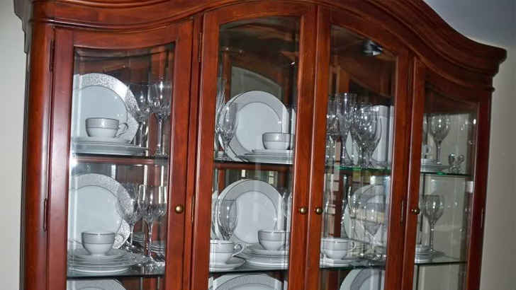
The fact of the matter is that collecting China just isn’t what it used to be. What once used to be a symbol of wealth and sophistication is now a tacky and dated way to decorate your room. While China sets can still be appreciated in certain settings, it’s best to keep them out of plain sight, or at least avoid making them any kind of focal point.
Sleigh Beds

ADVERTISEMENT - CONTINUE BELOW
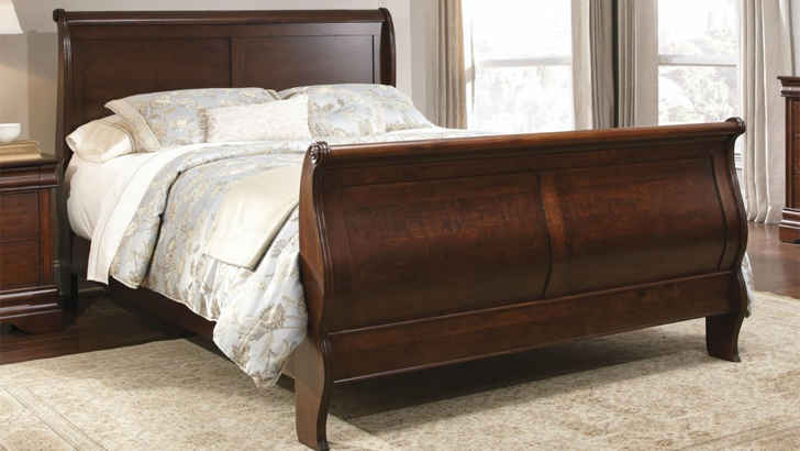
While these large, beautiful wood framed beds were once the talk of the town, their moment in the spotlight is done. This bed style is honestly too big, and takes up way too much space that you could be utilizing more efficiently. Not to mention how heavy and impractical they are to re-arrange. Save yourself the trouble by electing for a sleeker, more modern bed frame.
Farmhouse Decor

ADVERTISEMENT - CONTINUE BELOW
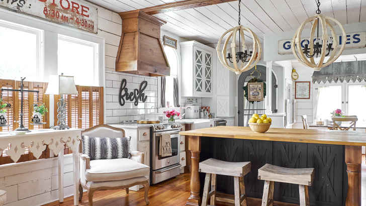
It’s almost as if the entire farmhouse decor trend was extremely played out before it even got popular. Now, loading your house with artificial wood signs indicating fresh produce and propping chickens on all your counters and ledges just looks cliché, and lacks a genuine feel of personal touch.
La-Z-Boy Furniture

ADVERTISEMENT - CONTINUE BELOW
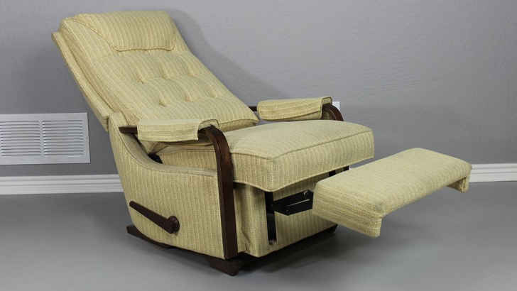
Usually when you start associating your home decor with one specific brand name, it’s not a good thing. La-Z-Boy was pretty popular, and for good reason, but the clunky reclineable furniture is no longer in style, and looks a tad pretentious for it to be your only style. It’s better to mix and match a few different types of seating styles.
Old Electronics

ADVERTISEMENT - CONTINUE BELOW
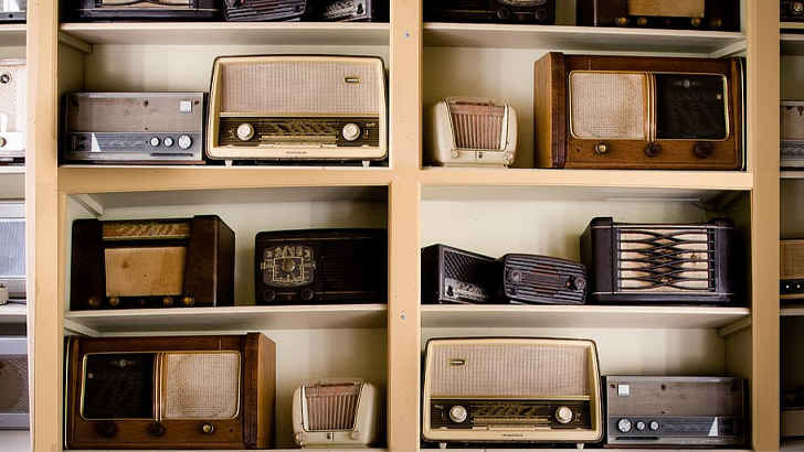
Everyone’s proud of their electronics, and we get it – you paid a lot for them, and even though that was years ago, they still hold value to you. Plus you might still use it, right? Well, even in that rare case, it’s still not worth using as a decoration tool. Letting old electronics sit around the house on shelves is not really appealing to anyone, and can easily be substituted for something more tasteful.
Patterned Sofas

ADVERTISEMENT - CONTINUE BELOW
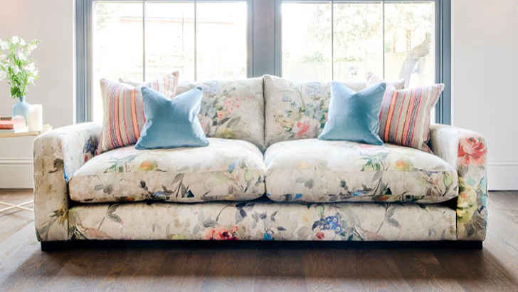
Maybe it’s a family heirloom or maybe it’s something you scored for cheap at a garage sale, but either way it’s not really something you want as a centerpiece in a room. Patterned sofas are extremely distracting, and often fail to match anything else in the room. And don’t decorate around a patterned sofa either, because it’ll just come out looking overly busy.
Tile Countertops

ADVERTISEMENT - CONTINUE BELOW
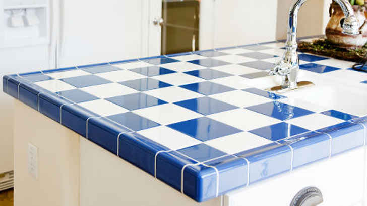
In the modern times when everyone is pivoting to shinier and more durable cuts of granite, being left in the dust with tile countertops is a sure way to indicate your home is outdated. Tile is loud, rough on glass and ceramics, and collects crumbs and other foods in the cracks, making it more of a pain to clean. Avoid tiles altogether on any kind of raised surface.
Potpourri

ADVERTISEMENT - CONTINUE BELOW
Let’s be honest, not even the odor of potpourri is appealing. The sudden scent of it just screams you’re getting old, and it sort of looks a bit tacky sitting in a piece of china you admittedly never use anyway. A nice smelling candle is really all you need, and there’s plenty of ways to make them look more aesthetically pleasing too.
Cherry Wood Furniture

ADVERTISEMENT - CONTINUE BELOW
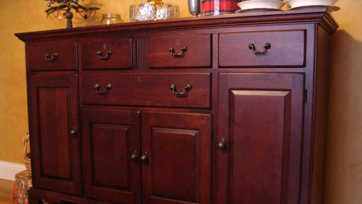
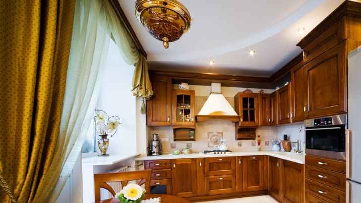
Cherry wood is a beautiful material, but when used and abused around the whole house, it can become overbearing on the eye, and honestly make it a lot harder to piece together the rest of your room. It’s a strong color, which asks a lot of the furniture and decor, calling for mostly dark tones, and of course, accompanying wood fixtures.
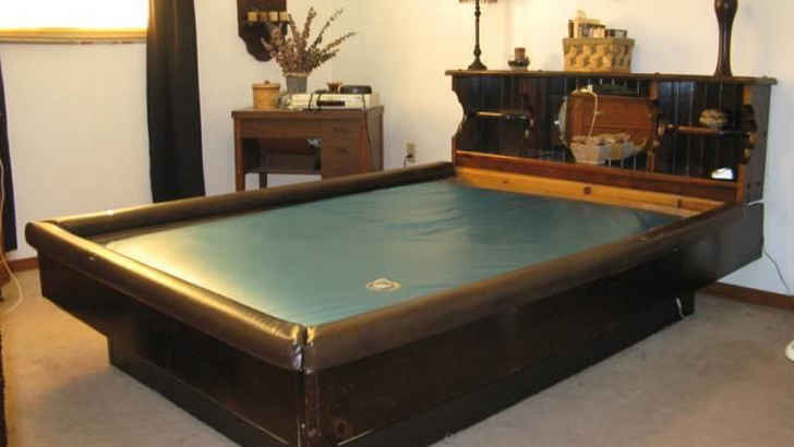
Waterbeds

ADVERTISEMENT - CONTINUE BELOW
Waterbeds were a phenomenon, that’s for sure, and although it was a fun trend while it lasted, everyone knows how much of a hassle they are to maintain, and how much harder they are on your back. It’s not the ‘70s or ‘80s anymore, so waterbeds should remain thought of as impractical. If you still have one, you’re either aging yourself or showing your immaturity.
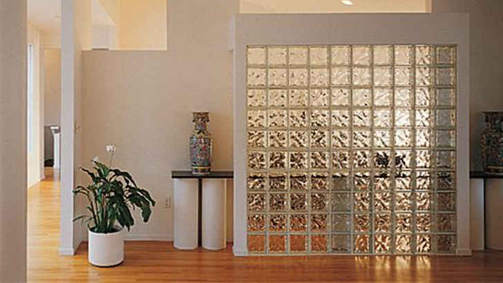
Glass Block Walls

ADVERTISEMENT - CONTINUE BELOW
One of the stranger, more futuristic home decor trends is the use of glass blocks to create chic walls that look modern, and also allow light to pass through in a subtle way. Typically found in bathrooms, the home design fail becomes more blatant when you see one of these out i the open entertaining space. Definitely avoid this at all costs.
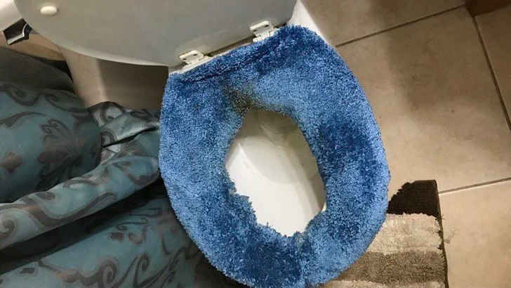
Fuzzy Toilet Seat Covers

ADVERTISEMENT - CONTINUE BELOW
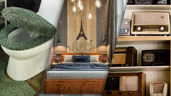
For whatever reason, people used to be obsessed with decorating their entire homes with carpeting, whether it was the floors or the wall, and yes, even on the toilet. Talk about over the top, it’s also worrisome to think about the bacteria that sits on top of it. Having to wash that? Not worth the time,
Brass Chandeliers

ADVERTISEMENT - CONTINUE BELOW
Much like glass, brass chandeliers and metal fixtures around your home pose immediate problems for the eye, creating mismatched accents when silver or metal isn’t an official theme of the room. Brass now looks outdated in comparison to modern decor trends, so in efforts not to date yourself, avoid these older items in your most forward-thinking room.
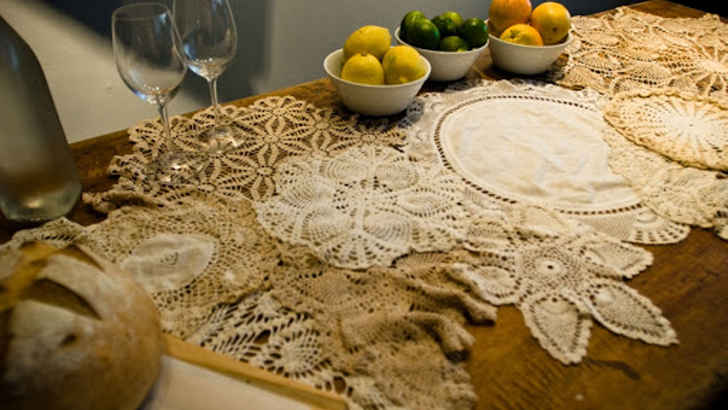
Doilies Everywhere

ADVERTISEMENT - CONTINUE BELOW
While in a distant time from the past people used to have doilies around their house to place under vases, lamos, photo frames, and numbers of other things, nowadays when you see them on surfaces, you immediately question the dating of the decor. Nothing about doilies are modern, and you should toss them all out immediately.
Wicker Furniture

ADVERTISEMENT - CONTINUE BELOW
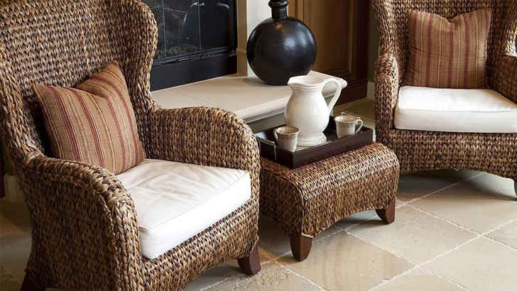
Another outdated furniture trope that’s easy to fall into is wicker furniture, because while it seems adventurous and gives you more of an outdoor feel to your room, it really just looks cheap and is ultimately uncomfortable for guests. Don’t bother with the wicker, and invest in simple lounge furniture instead.
Vanity Lighting

ADVERTISEMENT - CONTINUE BELOW
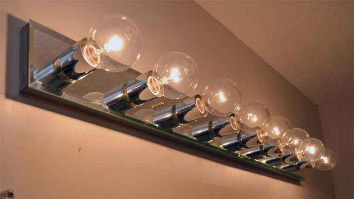
It was pretty cool when everyone’s bathrooms started to look like the backstage dressing room of a Hollywood set, but unfortunately it now just looks outdated. No one wants to change all of those bulbs, and the brightness and grandiose mirror size is just a bit overwhelming. Extravagant bathroom counters are a thing of the past, so it’s best to just keep it minimal.
Non-Refinished Cabinets

ADVERTISEMENT - CONTINUE BELOW
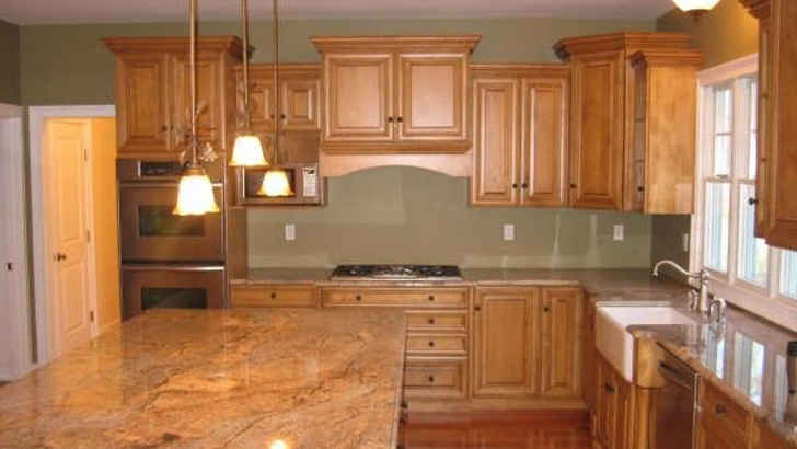
In a kitchen, one of the first areas to show considerable wear are the cabinets, especially if they’re wood. And refinishing cabinets can be a long, tough process, but if you don’t do so, it’s going to be highly noticeable. Adding that fresh coat of paint and new finishing makes all the difference.
Single-Themed Rooms

ADVERTISEMENT - CONTINUE BELOW
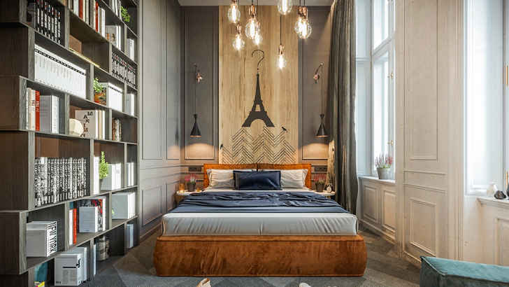
Themes are a great place to start when deciding how to decorate your room, but committing too heavily to a particularly foreign theme in comparison to the rest of your house is a big no-no. Whether it’s sea, safari, gardens or an international city, having a room that completely stands out from the rest of your home isn’t necessarily a good thing.
Tons of Plants Everywhere

ADVERTISEMENT - CONTINUE BELOW
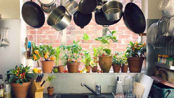
A few houseplants sprinkled about is one thing, but there’s really no reason to make your kitchen look like a greenhouse. Also, bringing your garden into your kitchen to appear more “earthy” really isn’t a good idea either, as that can run the risk of bugs, cross contamination, and starting a fire. Even die-hard herbalists agree – the kitchen is for cooking and the garden is for growing.
In-Kitchen Washer And Dryer

ADVERTISEMENT - CONTINUE BELOW
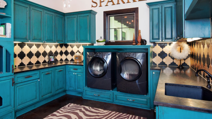
While this one isn’t quite as common as the rest, some people still actually think this is a good idea. To be fair, it isn’t wrong to want to multitask more efficiently, but this is too efficient. Either your schedule is way too tight, or you’re just a whole other level of lazy. If you do insist on doing this, though, then make sure you aren’t putting the clothes in the dishwasher and vice versa!
Plastic Couch Covers

ADVERTISEMENT - CONTINUE BELOW
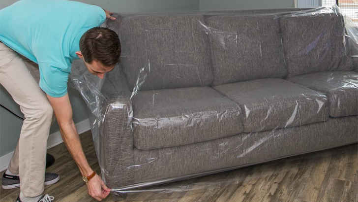
We all know how paranoid one can get after investing in a new couch and never wanting to expose it to whatever fate may come, but keeping a plastic cover on is the definition of tacky. Not only does it look like you have trust issues, but it’s also incredibly uncomfortable, which is basically the main point of a living room in the first place.
Furniture Skirts

ADVERTISEMENT - CONTINUE BELOW
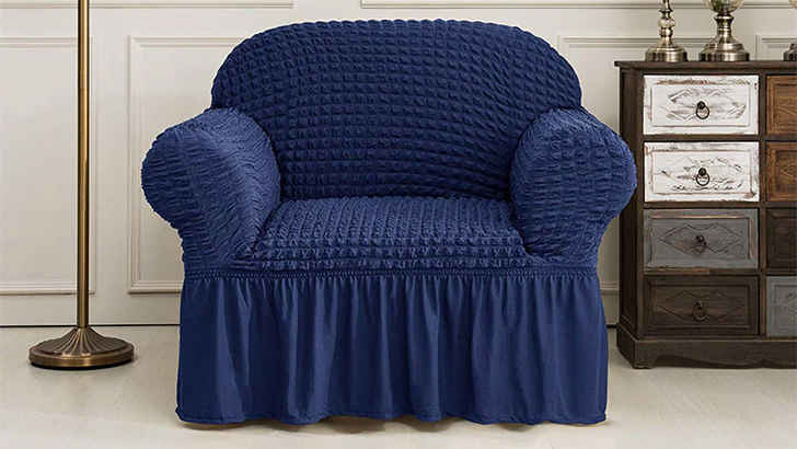
If you really want to date your living room, you’re going to have furniture that has ruffled skirts. These could not look more outdated, and show that you really don’t care to have a modern approach to the room’s design. Stick to cleanly trimmed and sleeker furniture to give the room a more stylish feel, and ditch the extra fabric that only looks aged.
Fluorescent Lighting

ADVERTISEMENT - CONTINUE BELOW
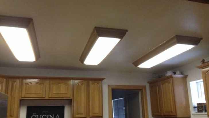
If you can’t afford to make extensive alterations to your kitchen, then don’t make matters infinitely worse by having disgusting fluorescent lighting brighten the place. The harsh, sterile feel of these bulbs will either make you feel like you’re at a morgue, hospital, or a trailer home. Unless that’s the exact look you’re aiming for, or you like exposing your eyes to harmful light, then just this one alteration can drastically improve your kitchen.
Obvious Room Labelling

ADVERTISEMENT - CONTINUE BELOW
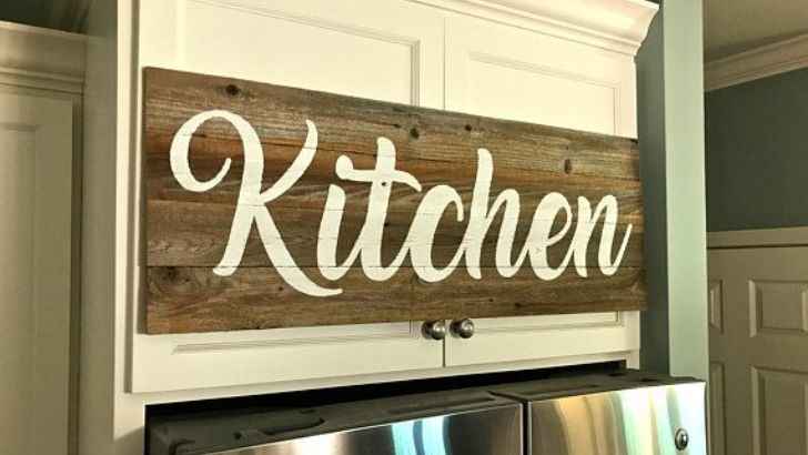
Unless your guests actually live under a rock, they will never enter the room in your home that has a fridge, stove, and microwave and wonder what room they’re in. As such, completely obvious signage with terms like “Eat!” is not only redundant, it’s just utterly tacky. Nobody needs to be reminded of where they are or what to do in the room that contains all the food. If you’re into the whole words on signs thing, then perhaps go for something that’s a little less obvious.
Shag Carpet

ADVERTISEMENT - CONTINUE BELOW
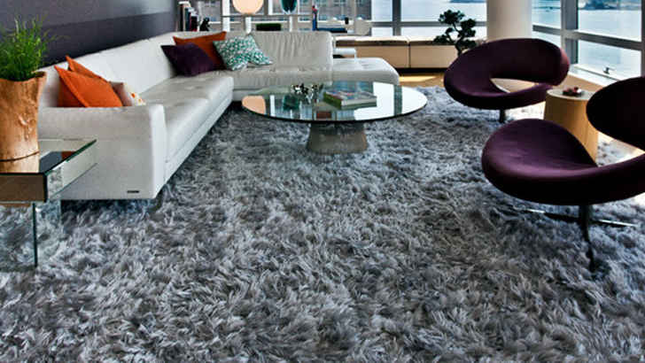
Shag carpeting is a thing of the past, and it’s definitely a fad we should leave there. Nowadays, modern style is much more sleek, and as we pointed out earlier, obnoxious carpets can throw off a room. If you have kids who spill or pets, shag carpeting is especially bad, so try and limit to thinner, more solid-toned rugs that complement rather than distract.
Wood Panelling

ADVERTISEMENT - CONTINUE BELOW
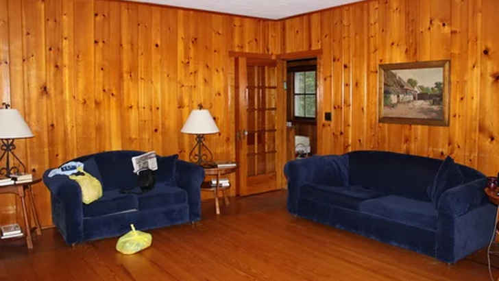
Wood belongs on floors, but not so much on the walls. Paneling like this is sure to make your room look outdated by at least 30 years, and again, though the cabin-like rustic feel may seem good in theory, it just looks played out and darkens your room. Don’t force yourself into a wood aesthetic unless you’re in the right rural area for it.
Fake Fruit

ADVERTISEMENT - CONTINUE BELOW
Ah yes, fake fruit. Because nothing says “I eat healthy” like a bowl of fruit-shaped wax. People don’t even realize how much of a rookie mistake this truly is, especially considering that even fake fruit is going to look gross after a while of sitting in close proximity to where you cook your food. Pick up some real fruit next time you’re at the grocery store, and maybe your guests will appreciate being able to bite into something sweet instead of something plastic.
Brass Handles

ADVERTISEMENT - CONTINUE BELOW
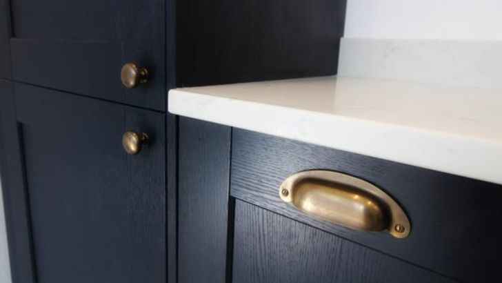
Brass used to be a staple component of kitchens back in the day due to its durability, but there’s a reason why it fell out of fashion once we moved into the modern age. After touching them just a few dozen times, those brass handles get gunked up and have to be cleaned regularly. Unless you like polishing several times a week, then get into the 21st century and opt for something like brushed nickel.
Strange Lamps

ADVERTISEMENT - CONTINUE BELOW
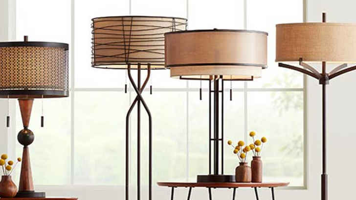
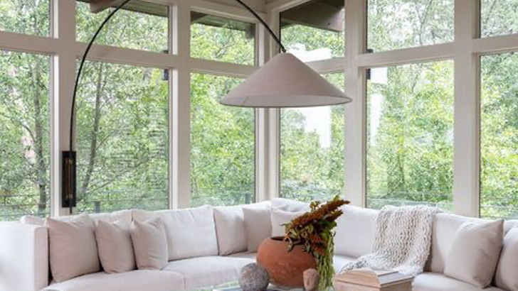
We all need some light in places where we may not have fixture’s overhead, but these crazy lamps have to stop. Multiple arms, bizarre shade covers, wildly curved frames – they all can throw off a room instantly. It’s alright to have a cool lamp, but make sure it fits the color and mood.
Curtainless Windows

ADVERTISEMENT - CONTINUE BELOW
Windows are pretty crucial when it comes to shaping what a room is capable of, largely because they control the natural light. However, if your windows don’t have curtains, you’re going to be limiting your room’s flare, while also leaving yourself exposed at night. Windows need curtains for more than just the practical purpose. They’re also a great accent that lets you change feels.
Gaudy Chandeliers

ADVERTISEMENT - CONTINUE BELOW
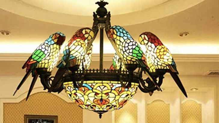
Ah yes, these. Because nothing says “I shop at thrift stores” like a stained glass chandelier. That’s not to say that one tasteful chandelier fixture can’t spruce up your kitchen, but there’s a fine line when it comes to these designs. Unless you have impeccable taste, then it’s usually best to just steer clear of these altogether. Plus, just dusting these things alone is an enormous hassle.
Window Valances

ADVERTISEMENT - CONTINUE BELOW
Do not make the mistake of choosing something so monumentally outdated for your kitchen. Unless your entire home is the Victorian motif, then window curtains will only stick out like three or four sore thumbs. Not only are they dark and dusty, but they’re also going to absorb every smell you generate in the kitchen.
Floating Shelves

ADVERTISEMENT - CONTINUE BELOW
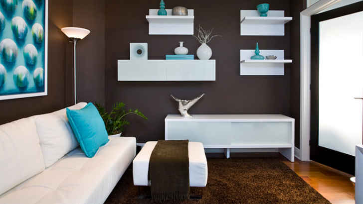
Shelving is important in any room, since you put a wide variety of objects on them and they tend to be slim and more off to the side. However, floating shelves raise a couple problems – first, they immediately draw attention to themselves, and the things up on them are bound to get dusty easily, or be hard to maintain if they’re plans or something. Avoid the hassle beforehand and don’t even think about implementing these.
The All-White Design

ADVERTISEMENT - CONTINUE BELOW
You may think the all-white look is minimalist, but you’re just gonna drive yourself crazy having to clean every tiny noticeable smudge in a kitchen like this. Things are gonna get messy in the kitchen, that’s just a given when it comes to cooking and baking, so the last thing you want to do is make every drip and stain instantly apparent. Plus, it makes your kitchen feel like a hospital… probably not the aesthetic you want!
Mason Jar Lights

ADVERTISEMENT - CONTINUE BELOW
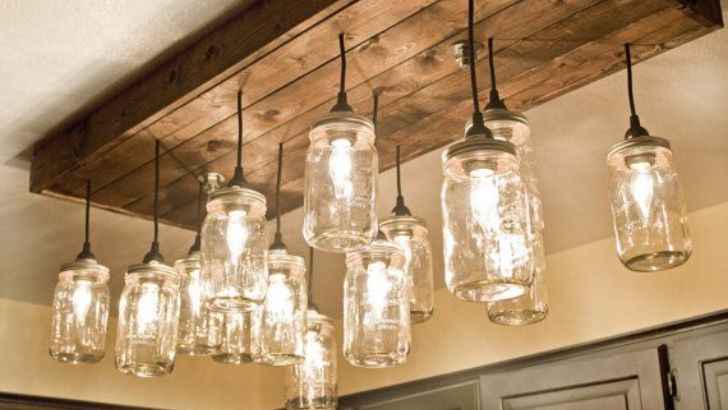
While you may think that decorating your kitchen using a jar that once stored your food is considered frugal, in reality it’s just extremely tacky. Either these people are rapid canners and want to get into recycling, or they’re just annoying trend-setters who think that going vintage and rustic makes them look alternative. In actuality, jars are these things used for jams and preservatives, and not for light bulb casings. People who hang mason jars just mere feet from their modern appliances are like those people who wear logos of bands that they likely don’t know more than two of their songs.
Clichê Art

ADVERTISEMENT - CONTINUE BELOW
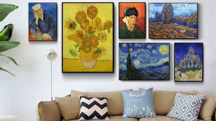
Art is a fairly controversial topic when it comes to design experts, as the jury is basically conflicted on whether it helps or hurts people’s living rooms more. Certain art can define a person or theme, but it’s easy to misplace “scenic” and “beautiful” art if they don’t correlate with a room’s color scheme. Also, stay away from any tacky classics, which just seem too try-hard.
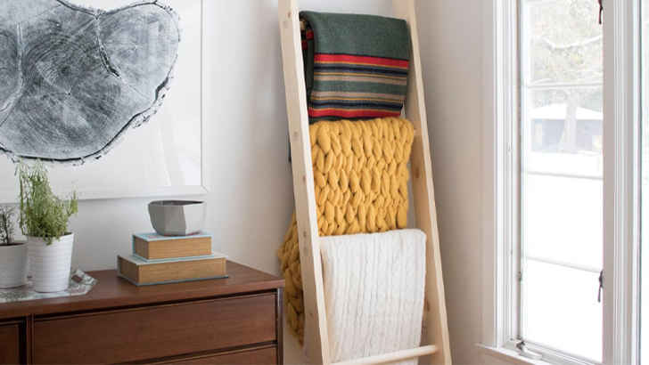
Blanket Ladder

ADVERTISEMENT - CONTINUE BELOW
Unfortunately, that ladder you have propped against your wall that you’ve draped with blankets is a tad strange. First of all, the ladder serves no true utilitarian purpose, and too many blankets also gives a more lazy than cozy vibe. If you want to have a bunch on hand, try storing them in an ottoman or foot rest. The effort is appreciated, but it doesn’t feel authentic.
