TRENDING
Hidden Meanings in Brand Logos
A good logo should be adaptable to various mediums, from print to digital, without losing its impact. Additionally, it should evoke emotions and leave a lasting impression on the audience, making them remember the brand. An effective logo should stand the test of time and continue to represent the brand effectively for many years to come.
Many brands embed hidden messages within their logos as a way to communicate a deeper meaning or to add an extra layer of creativity. These hidden messages add depth and personality to the brand, creating a more memorable and impactful logo. Here are some hidden meanings you probably never noticed in major brand logos before.
Beats by Dre
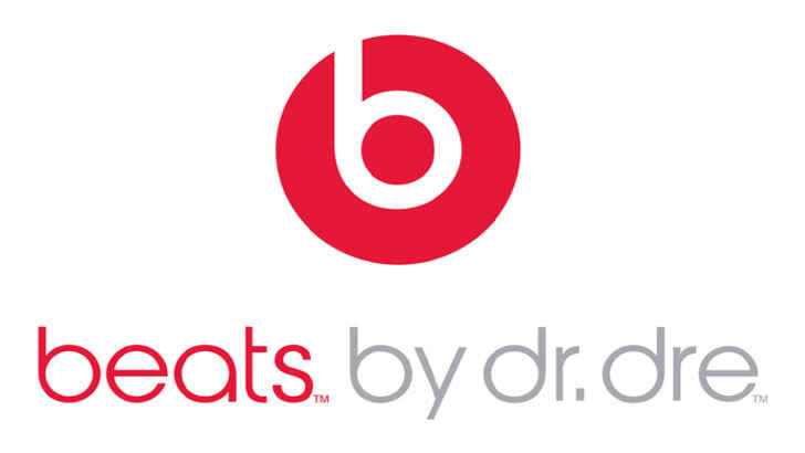
The Beats by Dre logo is straightforward, featuring a circle enclosing the letter ‘b’ followed by the brand name. The circle symbolizes a human head and the ‘b’ symbolizes the headphones, adding a personal touch to the brand and allowing customers to visualize themselves using the headphones.
Cisco
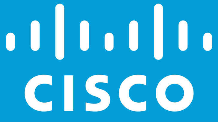
Cisco, the top global provider of internet networking solutions, takes its name from its San Francisco headquarters. The company’s name has no hidden meaning, but its logo features blue stripes above the text, symbolizing both an electromagnet and the iconic Golden Gate Bridge.
NBC
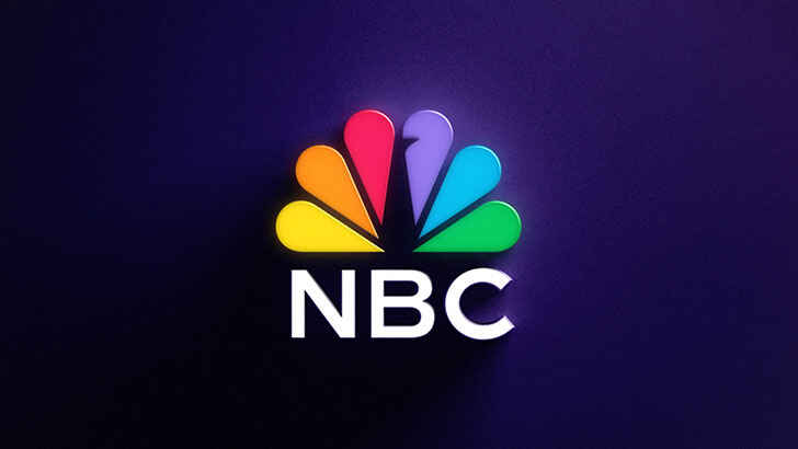
NBC’s logo, a peacock, has two underlying meanings. The logo was created when color TVs were introduced, and NBC wanted to promote its new color system and encourage black and white TV owners to upgrade. The logo’s rainbow of colors reflects this. The peacock was chosen as it represents pride, fitting with the phrase “proud as a peacock”, which NBC wanted to convey regarding its new color system. The six different colored feathers symbolize NBC’s six divisions.
Amazon
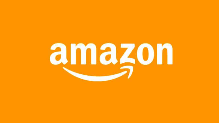
Amazon’s logo reflects its dominance in online shopping. The yellow arrow in the logo starts at the letter ‘a’ and ends at the letter ‘z’, suggesting that Amazon sells everything from A to Z. The arrow also resembles a smile, with the arrowhead being a stylized dimple or smile line, embodying the joy customers experience when shopping with Amazon.
Baskin Robbins
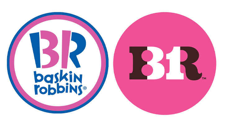
Baskin Robbins, known for its 31 flavors of ice cream, has the number 31 hidden in its logo. The number 31 appears as the curve of the letter ‘B’ and the stem of the letter ‘R’. The logo exudes fun and energy, mimicking the feeling of enjoying Baskin Robbins’ ice cream.
Roxy
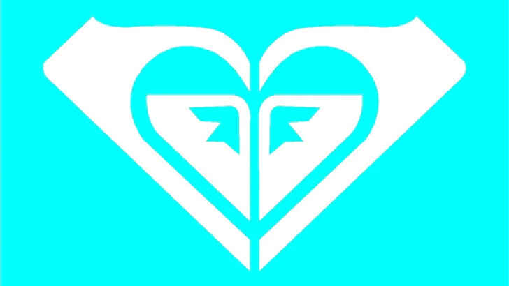
Roxy, Quicksilver’s women’s clothing line, uses a heart as its logo to appeal to its female audience. The heart’s feminine shape and symbolic meaning align with the target audience. The heart is unique as it is actually two Quicksilver logos turned on their ends.
Sony Vaio
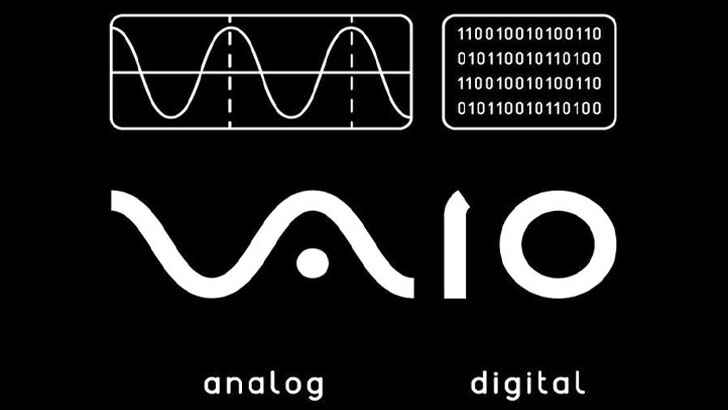
Sony Vaio, also known as Visual Audio Intelligent Organizer, is a renowned technology brand, but its logo meaning is lesser-known. The logo symbolizes the combination of analog and digital technologies in Sony Vaio products. The letters ‘va’ resemble an analog wave and the ‘io’ represent binary code (1 and 0) to reflect a digital signal.
Tour de France
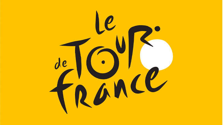
The Le Tour De France logo has two hidden messages. A cyclist forms the letter ‘r’, while the yellow circle representing the bike wheel also symbolizes a sun, signifying that the race takes place during the day.
BMW
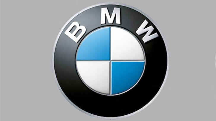
BMW’s blue and white logo colors come from the Bavarian flag. The logo, similar to Rapp Motor Works’, is often thought to depict spinning propeller blades, reflecting BMW’s aviation history and a 1920s ad.
LG
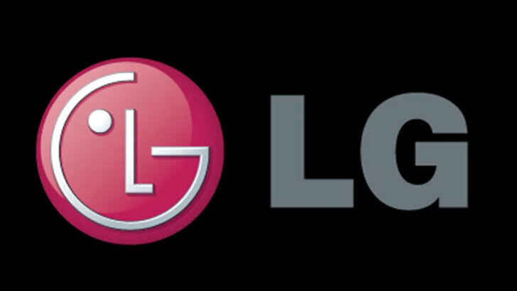
LG is a well-known brand, and its logo marked with the letters ‘L’ and ‘G’ is easily recognizable. However, many are unaware that the letters form a face, with the ‘L’ being the nose and the ‘G’ completing the face, making the brand more personable and approachable.
FedEx
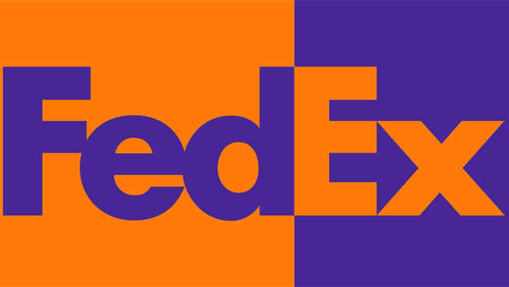
FedEx is a widely used shipping company with its logo displayed on vehicles worldwide. Though its design is straightforward, there is a subtle hidden feature in the space between the ‘E’ and ‘x’ letters forming an arrow. The arrow symbolizes the company’s focus on swift and precise delivery, reflecting FedEx’s brand image.
Tostitos
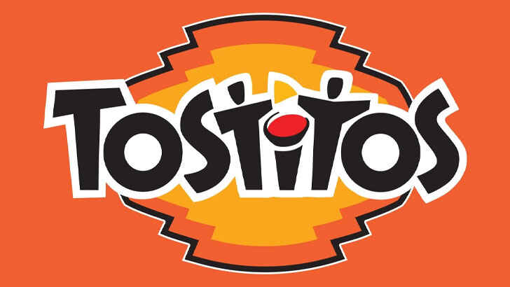
The Tostitos brand, known for chips and salsa, has a playful design in its typography. The letters “tit” depict two people relishing chips and salsa together, emphasizing the snack’s enjoyable and social nature.
Unilever
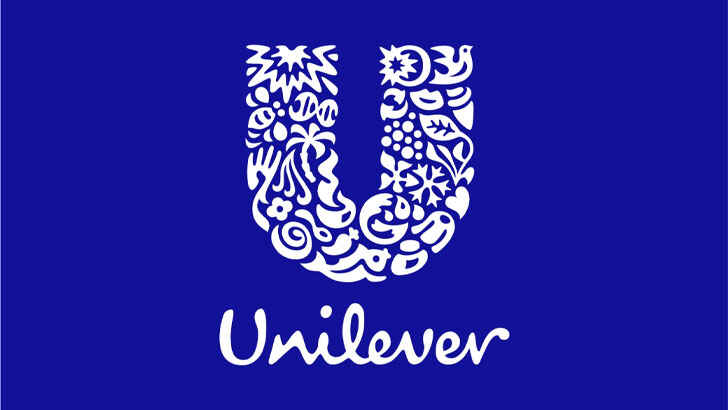
Unilever produces numerous products and to display this, they crafted a ‘U’ using symbols representing some of their key offerings. This creative approach highlights their presence in multiple fields, and provides the audience with a puzzle to solve.
Toblerone
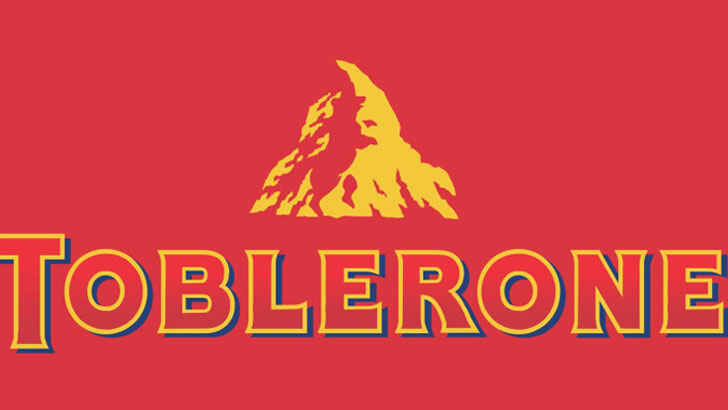
Toblerone, a well-known chocolate bar, has a long history. Its current logo depicts a mountain representing the Matterhorn in Switzerland. The design also features a bear hidden inside, symbolizing the distinct honey flavor in the chocolate and its origin in the “City of Bears.”
Goodwill
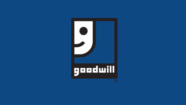
The Goodwill logo seems to depict a smiling face, symbolizing the positive experience of cleaning, donating, and recycling. However, it’s actually an enlarged version of the letter “g” in “Goodwill,” located at the bottom of the logo. Who would have thought?
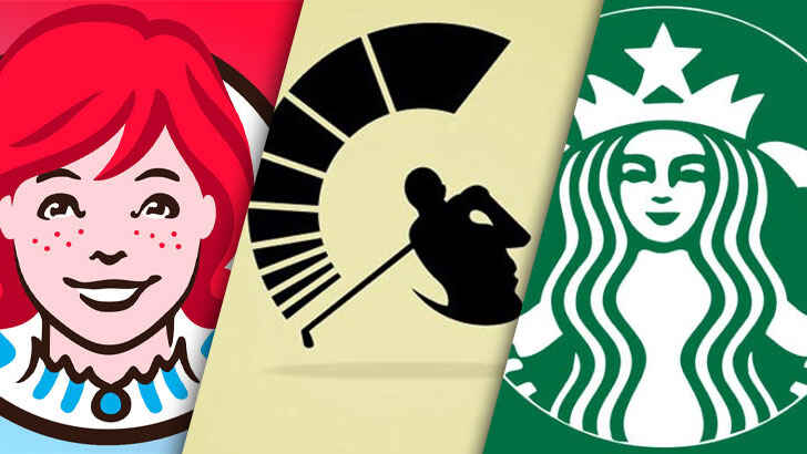
Wendy’s
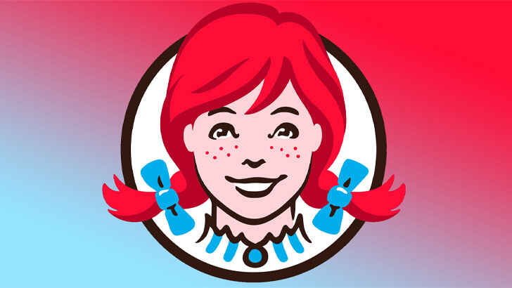
The Wendy’s logo appears simple, but it holds a hidden message. If you look closely, you’ll see the word “Mom” written in Wendy’s blouse collar. Some people believe it represents the chain’s goal of offering a home-cooked vibe, however, Wendy’s executives claim it was unintentional. Look at the original locations of your favorite fast-food joints.
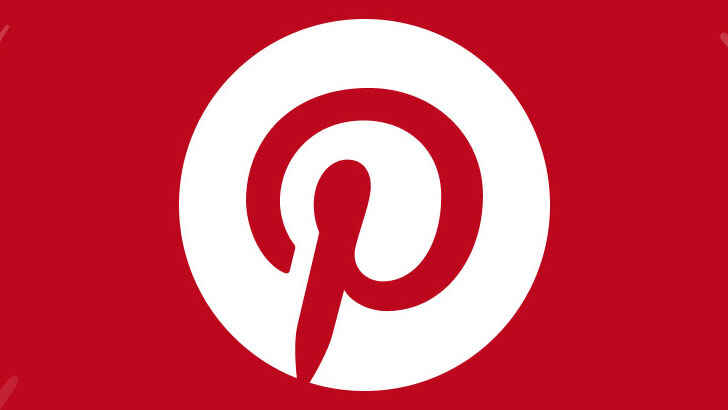
At first, the Pinterest logo appears straightforward with a capital “P” centered in a red circle. However, the company’s signature “P” also functions as a map pin symbol. A designer for the logo initially resisted adding an actual pin, but the final result formed naturally, as reported by CNBC.
Ray-Ban
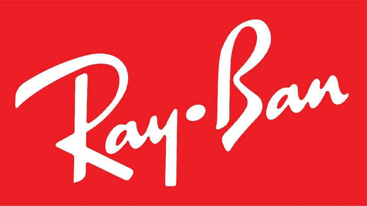
The logo features the company name in a stylish script font. Ray-Ban, known for its iconic sunglasses, incorporates a discreet pair of shades in the letter “B” (seen by tilting your head).
Wikipedia
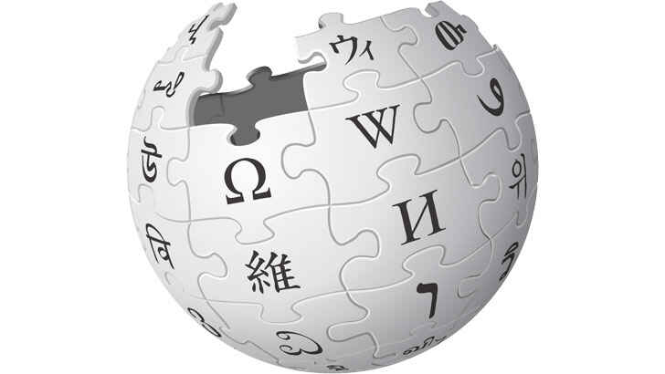
Wikipedia’s logo features an unfinished globe made of multilingual characters, reflecting the company’s incomplete mission of being the top information portal, and the idea that a user-generated site can never be fully complete.
London Symphony Orchestra
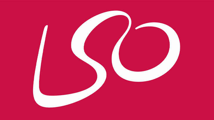
The London Symphony Orchestra’s logo is not just an abbreviation written in a fancy script font, but also a representation of a conductor, with the “L” and “O” forming the arms.
The Bronx Zoo
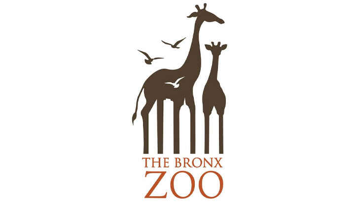
The Bronx Zoo’s former logo features two giraffes and some birds, but with a closer look, the negative space between the legs reveals the New York City skyline, making it even more fitting.
Milwaukee Brewers
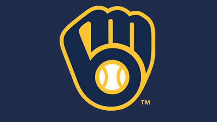
The Milwaukee Brewers have updated their logo, but still sell merchandise with the old design, which remains popular with fans. The creative design features a lowercase “M” and “B” forming a glove using the team’s initials.
Hope for African Children Initiative
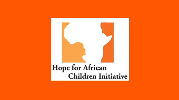
This logo definitely features the outline of Africa, and upon closer inspection, the orange and yellow sections reveal the shapes of a child and adult.
Adidas
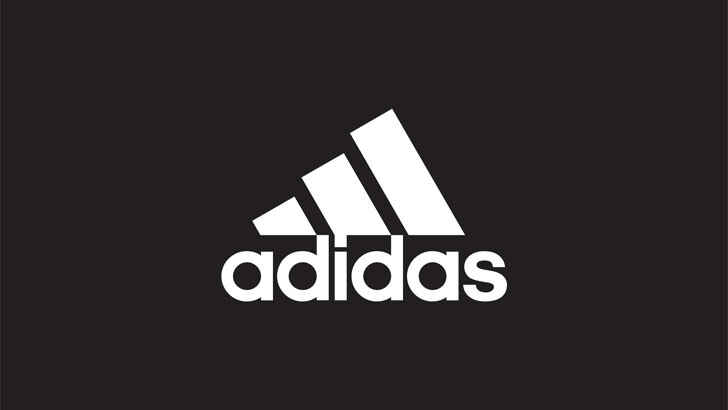
“Adidas” in bold, lowercase type draws attention, but the diagonal stripes symbolize a mountain representing the challenge elite athletes conquer.
Chick-fil-a
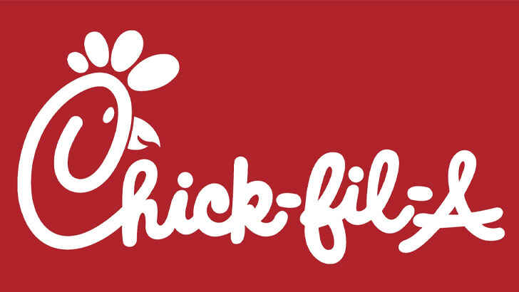
The bright red cursive company name is seen as cute and country-style, but the font is iconic to Chick-fil-A. Take note of the chicken in the “C” which represents the chain’s specialty in chicken.
Gillette
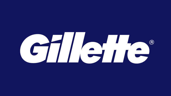
The slanted sporty font conveys speed, with a “razor-sharp” feeling. The angled “G” and “I” represent the brand’s signature product. This explains how your favorite store got its name.
Washington Capitals
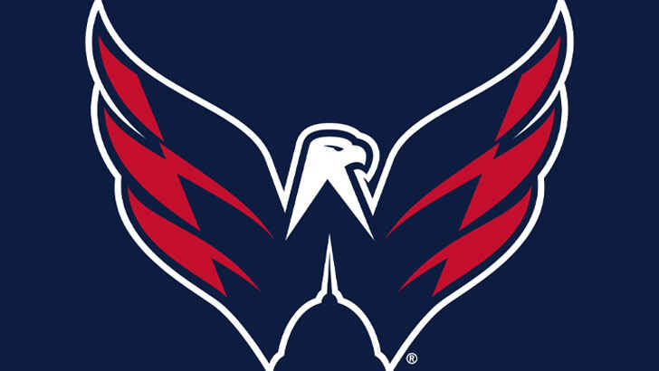
The logo of Washington, D.C.’s NHL team features a patriotic eagle in red, white, and blue. However, there’s a subtle detail that may have gone unnoticed. A silhouette of the Capitol building is hidden in the negative space at the bottom, paying homage to the team’s home city.
Hyundai
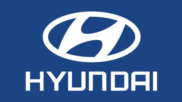
The Hyundai logo is a slanted, jazzy-style “H”, symbolizing speed. Or so it seems. Actually, it depicts two people shaking hands, representing a salesperson and a content car buyer.
Pittsburgh Zoo & Aquarium
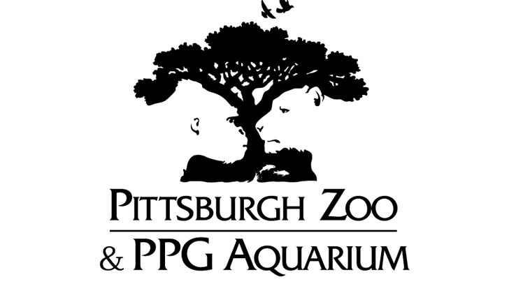
The white space in logos can be full of possibilities! The logo for the Pittsburgh Zoo & PPG Aquarium showcases this by depicting a gorilla and lion facing each other in the negative space.
Spartan Golf
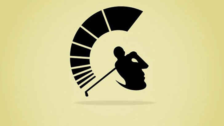
The Spartan logo is a prime example of subtle symbols in logos. It demonstrates that viewing designs from different perspectives can yield new and unique images. Initially, one might see a golfer preparing to hit a shot, with the flowing lines above the club symbolizing strength. But it’s also possible to see the shape of the golfer’s body as depicting a Spartan helmet and face.
Toyota
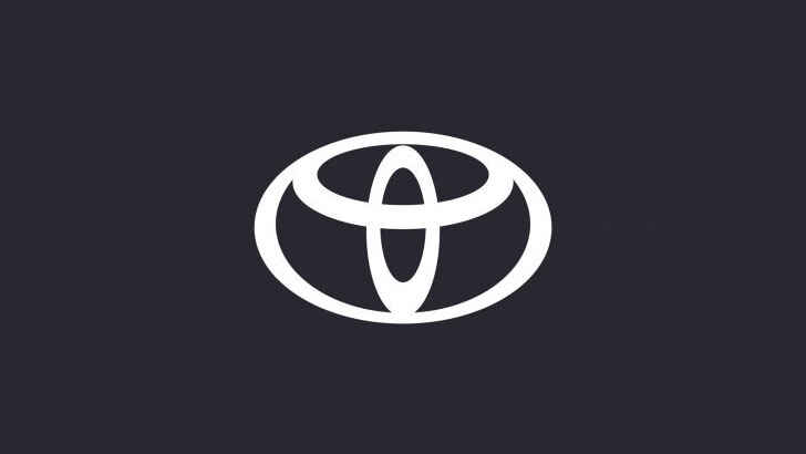
Toyota’s current logo has been in use for many years and is widely recognized as a well-known car emblem. The design resembles a “T” but holds much deeper significance. The overlapping rings symbolize the connection between Toyota’s customers and products. Some designers argue that all letters of the Toyota name can be formed from the symbol by viewing specific shapes.
Audi
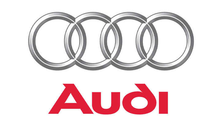
The Audi logo showcases the hidden meanings often found in auto logos. Its four overlapping rings symbolize the four companies that merged to form Audi Auto Union. The design highlights Audi’s history and the diverse elements that come together to create its products.
Continental
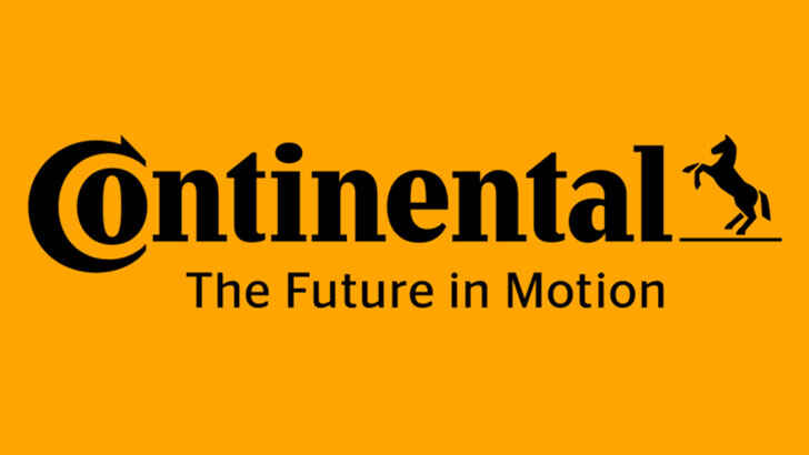
The Continental logo demonstrates that logos with secret messages can originate from typography choices and spacing. The “O” in Continental is nested within the “C”, forming the shape of a tire, emphasizing the brand’s primary product focus.
Apple
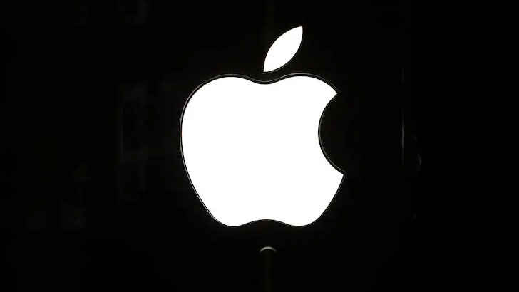
Apple is known for its use of implicit messages. The name “Apple” references Isaac Newton and his groundbreaking discoveries. The Apple logo, a bitten apple, symbolizes the bite taken by Eve from the Tree of Knowledge in the biblical story. This logo is now one of the most recognizable in the world.
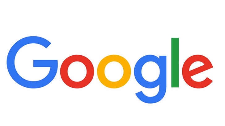
Ever pondered why Google’s logo is so vibrant? Its not only to showcase the brand’s playful nature, but also represents the company’s innovative spirit. Instead of using solely primary colors, Google breaks the mold with the inclusion of a green “l”.
IBM
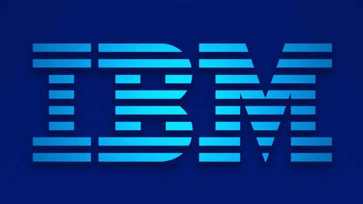
Have you wondered why IBM’s logo features stripes rather than solid letters? It’s not just to stand out from other tech logos. IBM intended for the white stripes to resemble equal signs in some parts of the letters, emphasizing the brand’s values of equality.
Dell
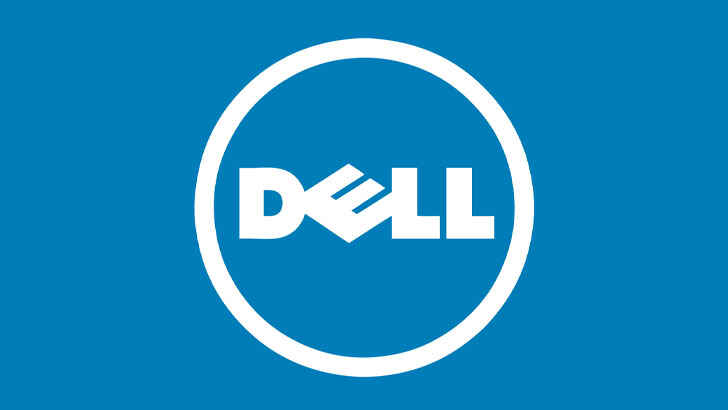
Dell’s decision to rotate the “E” in its logo was not just to appear distinctive. The founder wanted to “turn the world on its ear” during the early stages of the company’s growth. The angled “E” symbolizes this aim to revolutionize the technology industry.
Domino’s
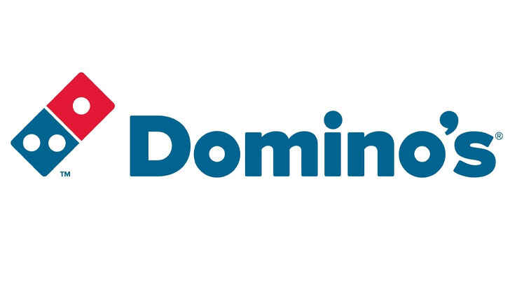
The three dots symbol now ubiquitous in pizza restaurants represent the three original restaurants where the pizza legacy began. The founder intended to add a dot for each new chain that opened, but the rapid growth of the business made it unfeasible.
Levi’s
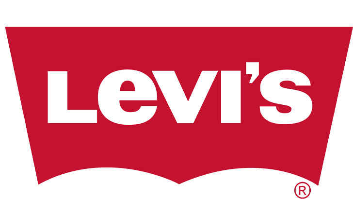
What’s the secret in this logo? The clever use of negative space. The space resembles the classic Levi’s pocket, shaped as a batwing, found on every pair of their pants.
Hersey’s Kisses
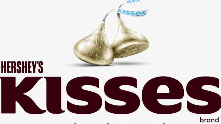
Chocolate lovers eagerly anticipate unwrapping Hershey’s Kisses, and the logo offers a preview. A sideways chocolate kiss is hidden in the lettering between the “K” and “I”. If only every package had an extra kiss!
McDonald’s
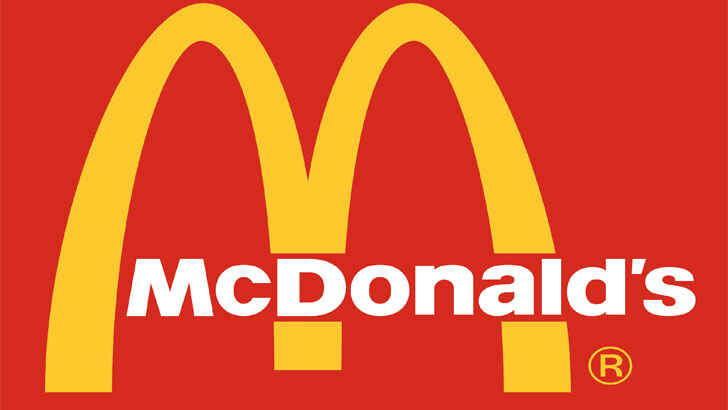
Many believe the McDonald’s logo is the letter “M” for McDonald’s, but the original golden arches were part of the restaurant chain’s building design. They connected to an overhang for rain protection when customers ordered outside. The arches were easily visible from the freeway, attracting customers, leading to their continued use as a symbol of the brand.
Disney
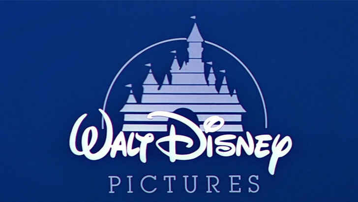
Contrary to popular belief, the Disney logo wasn’t based on Walt Disney’s signature. It was created by a woman in his company to align with the family-friendly and whimsical Disney image. This caused difficulties for Walt, as people requested his autograph using the logo’s design, but his actual signature differed.
Starbucks
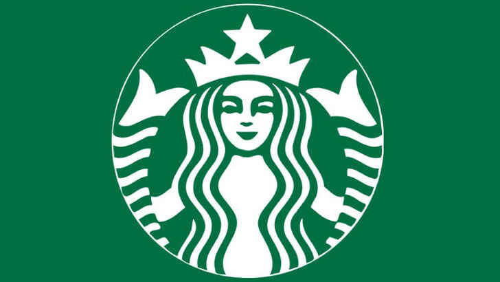
Starbucks, based in Seattle with its seaport roots, chose a nautical symbol for its logo. The original logo was inspired by a 16th-century Norse woodprint of a naked siren with two tails. Over time, the Starbucks siren image evolved, including a recent redesign to crop the image, reducing the visibility of nudity.
Pepsi
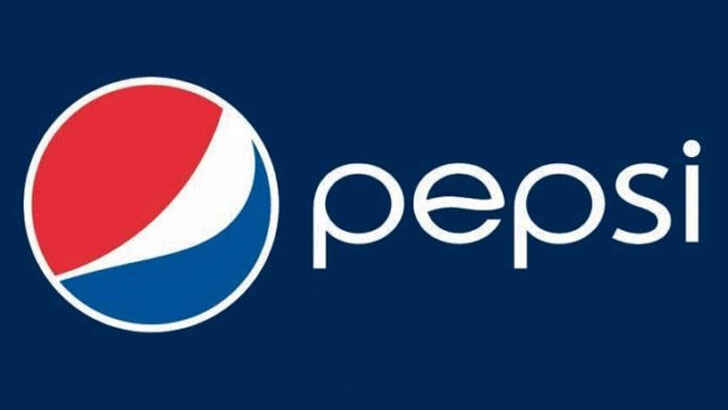
The Pepsi Globe logo was created in the 1940s during WWII, featuring patriotic red, white, and blue colors to show support for troops overseas. Initially only used on bottle caps, it became the official logo by 1945, thanks to its popularity among consumers.
Paramount Pictures
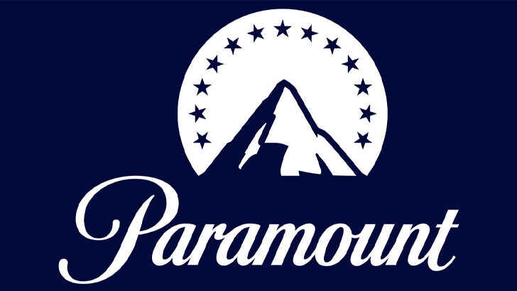
The Paramount Pictures logo was created by founder William Wadsworth Hodkinson and legend says he drew it on a napkin. The mountain peak symbolizes Ben Lomond Mountain. The original logo had 24 stars surrounding it, representing the 24 actors signed with the studio.
Nike
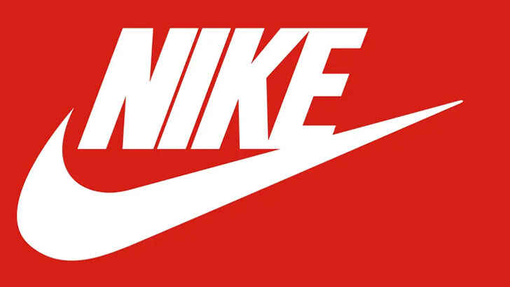
Carolyn Davis, a design student, designed the Swoosh logo for Nike and was paid only $35. Despite this, her design grew with the company, earning her a diamond ring in the Swoosh design and 500 Nike shares in retroactive compensation. The Swoosh was intended to convey motion and rival the simplicity of the Adidas logo. It needed to be simple yet eye-catching for shoe printing.
Mitsubishi
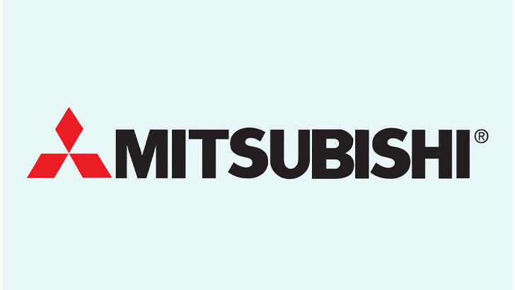
The Mitsubishi logo dates back to the 1870s in Japan, when the Tosa clan purchased the Tsukumo Shokai shipping firm from the Iwasaki family. The Iwasaki crest was three stacked rhombuses, or chestnuts, while the Tosa family crest was a three-leafed oak symbol. These two crests were combined to form the three diamond logo we see today. The company was rebranded as Mitsubishi, meaning “three diamonds” in Japanese, a reference to its logo and history.
Gerber
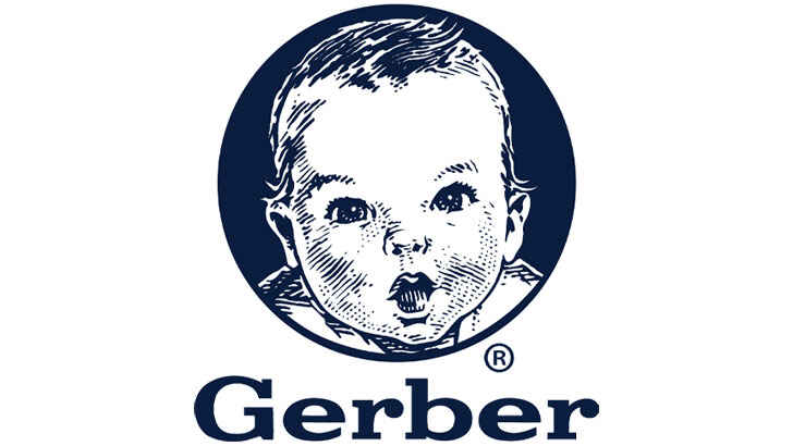
Gerber is associated with babies due to its iconic Gerber Baby logo on all products. It started as the Fremont Canning Company, but when it began selling strained vegetables and fruit as baby food, it held a competition for the Gerber Baby design. The winner was a sketch by Dorothy Hope Smith of Boston’s neighbor’s baby, Ann Turner Cook, and it was used as-is and has remained unchanged since 1928. The success of the Gerber Baby led the company to change its name to Gerber.
DC Comics
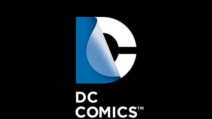
DC Comics updated its logo to reflect its expanded media group beyond comics, as comic book-based movies gained popularity. Despite criticism from comic book fans, the new logo showcased DC’s bold move towards a new direction. The logo features the letter “D” peeling back like a page to reveal the letter “C,” honoring the comics origins. DC adjusts the logo’s appearance to match its current promotions or characters.
Chupa Chups
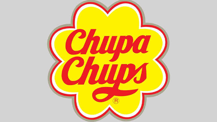
Salvador Dali, known for his surrealism, cubism, and Dadaism, also designed the logo for Chupa Chups lollipops. While the text was already established, Dali added the flower shape and suggested moving the logo to the top of the wrapper for better visibility to the consumer.

About Bon Voyaged
Welcome to Bon Voyaged, your gateway to a world of adventure, exploration, and cultural discovery. Whether you're an intrepid globetrotter planning your next big adventure, a travel enthusiast seeking inspiration for your bucket list, or simply someone looking to escape through the wonders of travel from the comfort of your own home, our platform is here to provide you with a wealth of information, tips, and inspiration. Join us in celebrating the beauty and diversity of our world as we share stories, recommendations, and a passion for wanderlust that knows no boundaries.


TRAVELMar
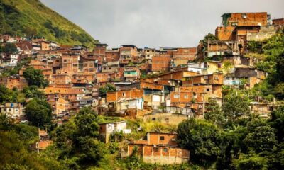
10 Most Dangerous Places To Avoid In The World
The 10 most dangerous places in the world encompass regions facing a myriad of formidable challenges. From Syria’s devastating and...


TRAVELMar
6 Things That Totally Annoy TSA Agents And What To Do Instead
Navigating through airport security can often be a stressful part of traveling. Understanding what frustrates TSA agents and how to...
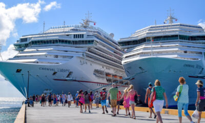

EXPLOREMar
8 Tips Cruise Travel Agents Leave Out When Helping You
Embarking on a cruise is an adventure like no other, offering a unique blend of relaxation, exploration, and entertainment. However,...


TRAVELMar
12 Things You Should NEVER Do On A Cruise
Embarking on a cruise is an exciting adventure, offering a unique blend of relaxation, exploration, and entertainment. However, to ensure...