Living rooms are the ultimate entertaining space, whether it be when guests are over, or your own family is gathering for a movie night. And for that reason, you want a room that’s comfortable, yet spacious and functional. Style is important, but it’s easy to get carried away.

ADVERTISEMENT - CONTINUE BELOW
There are some glaring mistakes many people make when designing their living room, and most don’t realize how outdated and tacky some of these “features” can be. Unfortunately, not everything trendy is practical, so here are the biggest mistakes you might be making when it comes to your living room’s design and decor.
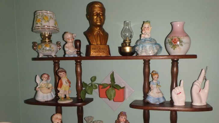
Knick Knacks
ADVERTISEMENT - CONTINUE BELOW
Sure, it’s cool to save your family heirlooms and pick up cool figurines at the antique shop, but cluttering your entire room with knick knacks is definitely a no-no. Not only do they distract the eyes and feel busy, they also gather tons of dust and look silly without a theme. Try and confine these to a special case, preferably in a separate room.
Strange Lamps

ADVERTISEMENT - CONTINUE BELOW
We all need some light in places where we may not have fixture’s overhead, but these crazy lamps have to stop. Multiple arms, bizarre shade covers, wildly curved frames – they all can throw off a room instantly. It’s alright to have a cool lamp, but make sure it fits the color and mood.
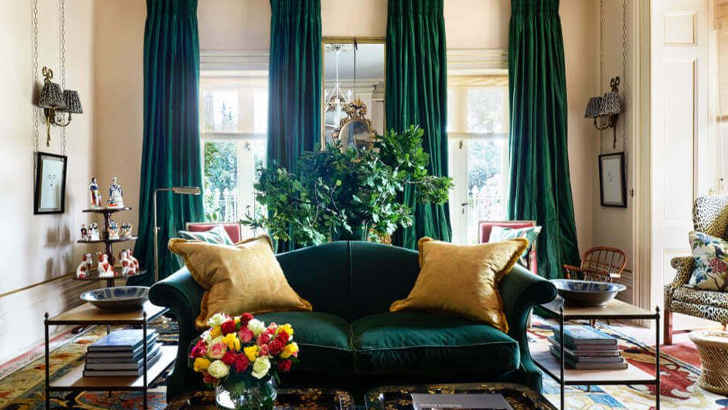
Curtains That Match the Couch
ADVERTISEMENT - CONTINUE BELOW
Coordination is important when it comes to interior design, but too much matching can get you in trouble fast. When you match your curtains with something like a couch, both the side walls and floor all start to blur together. This can seem very cheesy, and often makes a room look outdated, or too forced.
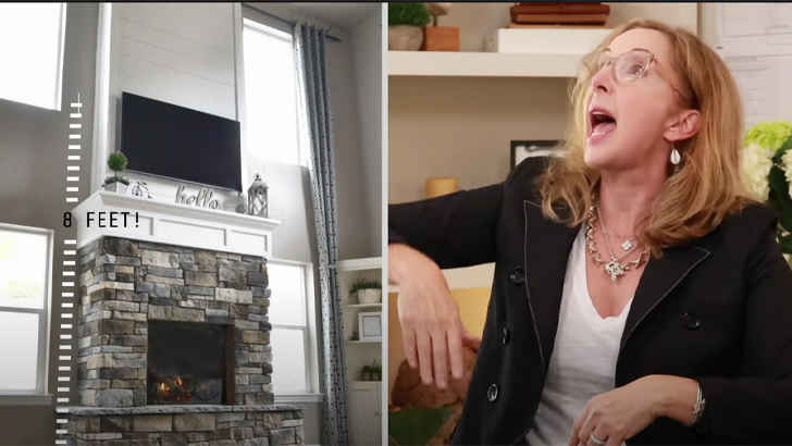
Fake Fireplace
ADVERTISEMENT - CONTINUE BELOW
Although the idea of an artificial fireplace seems nice from an aesthetic perspective, it just doesn’t offer the same charm a real wood fireplace does. You can tell it’s not real by how it sits within the walls, and the heat is nowhere near as nice as a real fire. All that, and it tends to leave behind smells of gas.
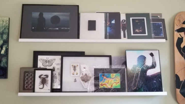
Frameless Photos
ADVERTISEMENT - CONTINUE BELOW
Everyone loves showing off their favorite memories, and what better place to do it than in your most lived-in room. However, if these pictures are just presented all willy nilly, and propped against a shelf or vase, you probably should frame them. This helps subtly tie the room together and makes your family and friends more proud to be presented in an eye-catching way.
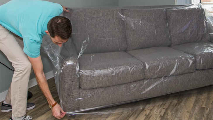
Plastic Couch Covers
ADVERTISEMENT - CONTINUE BELOW
We all know how paranoid one can get after investing in a new couch and never wanting to expose it to whatever fate may come, but keeping a plastic cover on is the definition of tacky. Not only does it look like you have trust issues, but it’s also incredibly uncomfortable, which is basically the main point of a living room in the first place.
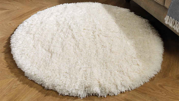
Small Rugs
ADVERTISEMENT - CONTINUE BELOW
Let’s be frank – small rugs serve no purpose, and mostly throw off a room by adding an extra item. You don’t want the floor to have too many things, and since rugs are meant to pull rooms together, small rugs just feel discombobulated. They’re also usually impractical, not really providing a purpose. Rugs should be large, and have two legs of furniture on it if possible.
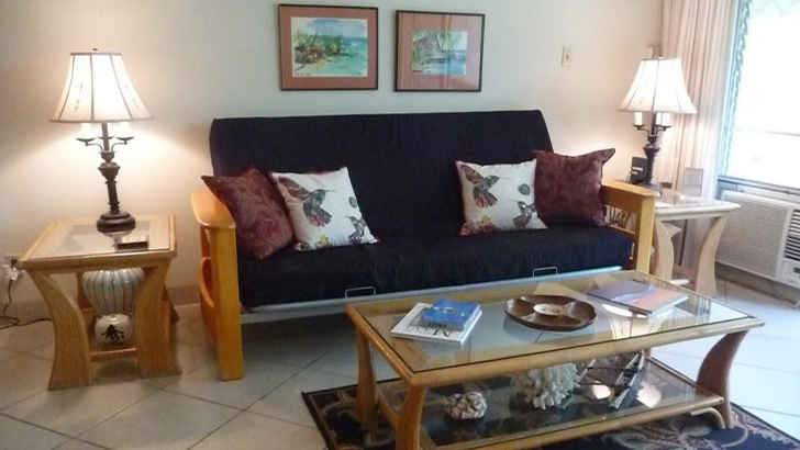
Futons
ADVERTISEMENT - CONTINUE BELOW
While a futon may be comfortable and practical, especially for people who have pets, they’re just not going to make your living room feel formal. Futons usually don’t live up to the expectations your other furniture has for it, and it sticks out like a sore thumb. Stick with a sectional, or recliners that provide the same comfort without compromising style.
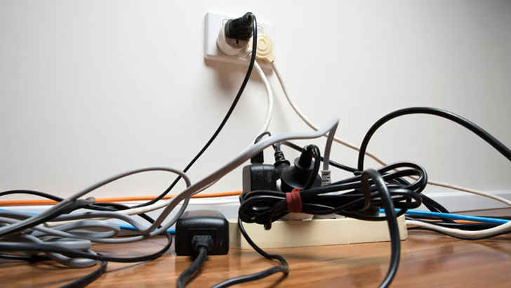
Tangled Cables
ADVERTISEMENT - CONTINUE BELOW
One of the most frustrating problems that arises in living rooms is that you also want it to be stocked with the best electronics for entertainment. And while companies have gotten better about making things wireless, power cables, HDMIs, and all the other things that can get tangled at the power source can really ruin a room. Make sure to tie and conceal them away.
Temporary Furniture
ADVERTISEMENT - CONTINUE BELOW
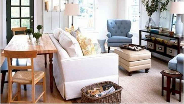
One problem that people don’t think of when their living room is the first place you enter in the home is how likely you are to just leave random temporary furniture there for the time being. Whether it’s a chair you just got and don’t know where to put, or a coffee table you’re holding for someone, it’s more obvious than you think, and likely doesn’t fit. Try to avoid this by storing elsewhere.
Fake Plants
ADVERTISEMENT - CONTINUE BELOW
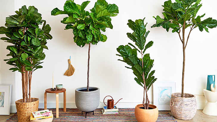
Sure, fake plants may seem like a good idea if you’re standing in the store and wondering how to spruce up your room without any effort, but don’t even think about it. Fake plants are unappealing and corny, and ultimately show you just aren’t willing or capable to take care of real ones. If you want green, go real or bust.
Intense Walls
ADVERTISEMENT - CONTINUE BELOW
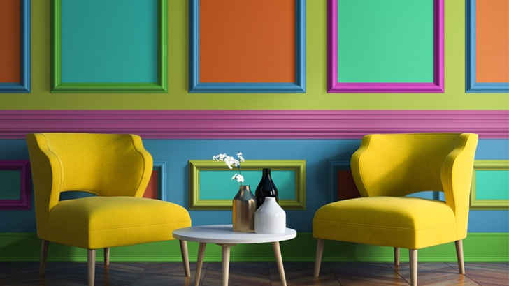
You definitely want a lively color when designing your ultimate living room, but going too bold can honestly backfire pretty quickly. Having a strong wall tone can feel overwhelming, and ultimately makes it harder to complete the room, because everything else needs to fit the vibe. Intense paint is always good in theory, but it’s almost always better to stick to subtle shades.
Curtainless Windows

ADVERTISEMENT - CONTINUE BELOW
Windows are pretty crucial when it comes to shaping what a room is capable of, largely because they control the natural light. However, if your windows don’t have curtains, you’re going to be limiting your room’s flare, while also leaving yourself exposed at night. Windows need curtains for more than just the practical purpose. They’re also a great accent that lets you change feels.
Clichê Art

ADVERTISEMENT - CONTINUE BELOW
Art is a fairly controversial topic when it comes to design experts, as the jury is basically conflicted on whether it helps or hurts people’s living rooms more. Certain art can define a person or theme, but it’s easy to misplace “scenic” and “beautiful” art if they don’t correlate with a room’s color scheme. Also, stay away from any tacky classics, which just seem too try-hard.
Blanket Ladder
ADVERTISEMENT - CONTINUE BELOW
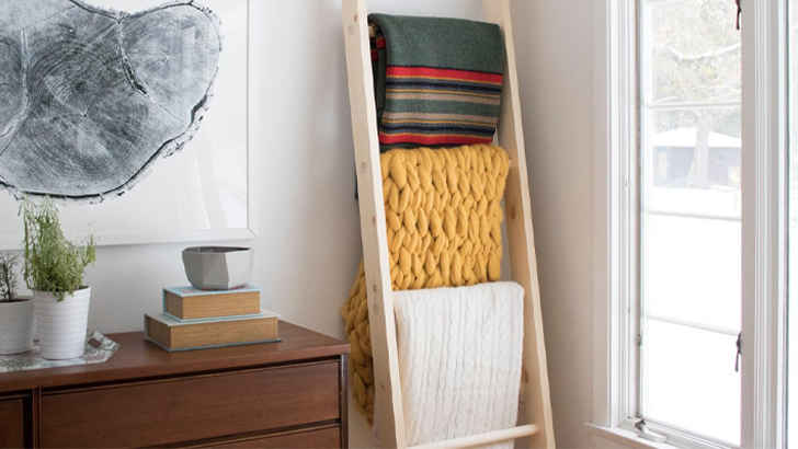
Unfortunately, that ladder you have propped against your wall that you’ve draped with blankets is a tad strange. First of all, the ladder serves no true utilitarian purpose, and too many blankets also gives a more lazy than cozy vibe. If you want to have a bunch on hand, try storing them in an ottoman or foot rest. The effort is appreciated, but it doesn’t feel authentic.
Furniture Skirts
ADVERTISEMENT - CONTINUE BELOW
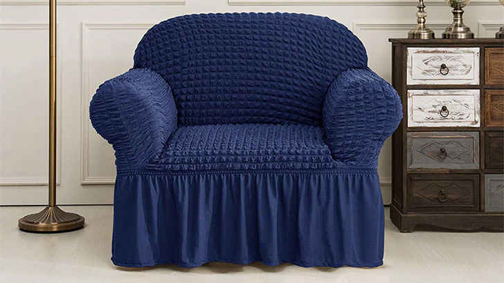
If you really want to date your living room, you’re going to have furniture that has ruffled skirts. These could not look more outdated, and show that you really don’t care to have a modern approach to the room’s design. Stick to cleanly trimmed and sleeker furniture to give the room a more stylish feel, and ditch the extra fabric that only looks aged.
Floating Shelves
ADVERTISEMENT - CONTINUE BELOW
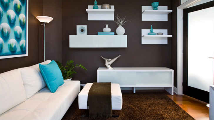
Shelving is important in any room, since you put a wide variety of objects on them and they tend to be slim and more off to the side. However, floating shelves raise a couple problems – first, they immediately draw attention to themselves, and the things up on them are bound to get dusty easily, or be hard to maintain if they’re plans or something. Avoid the hassle beforehand and don’t even think about implementing these.
Worded Signs
ADVERTISEMENT - CONTINUE BELOW
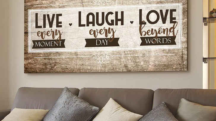
You know exactly what we’re talking about. “Live, Laugh, Love.” Don’t do it. “Bless this Mess.” No, you shouldn’t. “This is Our Happy Place.” Not anymore. These are not, and never will be okay, and if you ever think they are, you’re wrong. Talk about an all-time high on the cheesy scale.
Mounted Heads
ADVERTISEMENT - CONTINUE BELOW
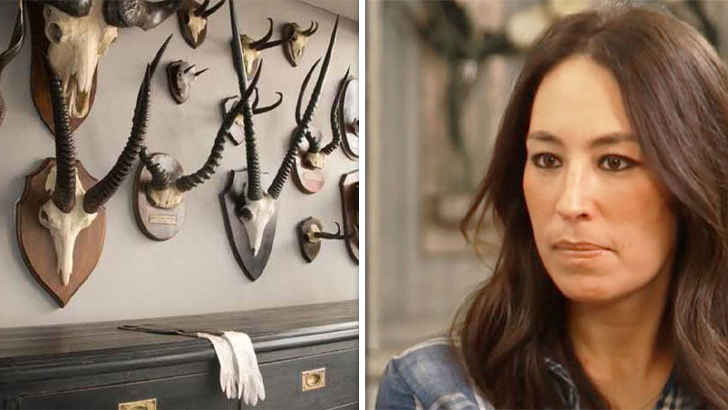
It’s kind of hard to believe anyone would actually want a huge taxidermy head staring at them whenever they’re in the room, but if you hunted it yourself, maybe we’ll let it slide. Either way, not really something to put in your living room, definitely because it’s creepy, but mainly because it almost never meshes well unless you’re in a total cabin themed living space, and even then, why?
Barn Doors
ADVERTISEMENT - CONTINUE BELOW
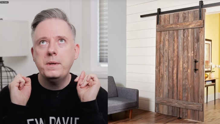
Of course it seems like a cool idea to implement a sliding barn door as a room divider, but let us tell you that it most definitely is not. Not only does it stick out like a sore thumb, but it applies a fake rustic look to the room, which asks too much of the rest of the decor. Keep it simple, and go with no door at all before adding the barn door.
White Room
ADVERTISEMENT - CONTINUE BELOW
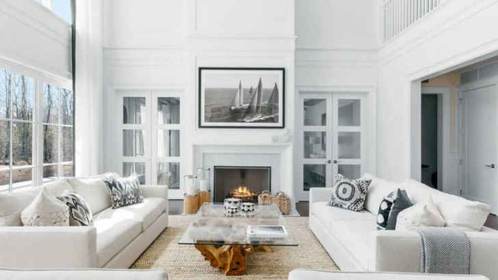
Since the turn of the century, there’s been an increased fascination with all-white themed living rooms, but let us tell you that it comes off extremely strong. Not only is the whole room bright and very prone to dirt and stains, but it gives off a snarky vibe leading guests to assume your home is no fun and you’re a neat freak. Color gives your room character.
Shag Carpet
ADVERTISEMENT - CONTINUE BELOW
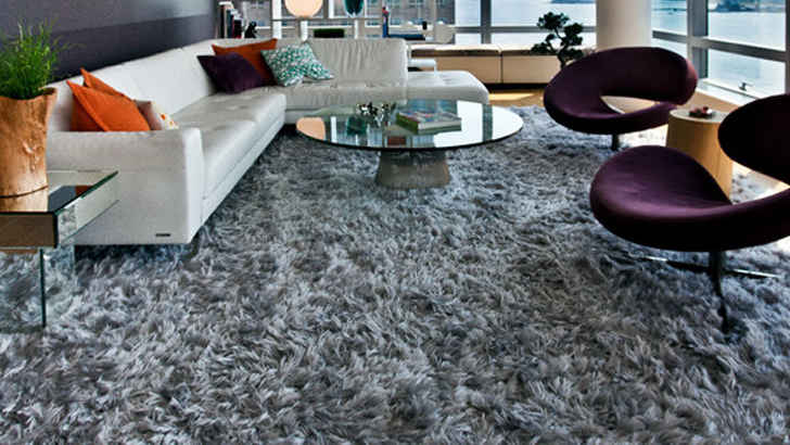
Shag carpeting is a thing of the past, and it’s definitely a fad we should leave there. Nowadays, modern style is much more sleek, and as we pointed out earlier, obnoxious carpets can throw off a room. If you have kids who spill or pets, shag carpeting is especially bad, so try and limit to thinner, more solid-toned rugs that complement rather than distract.
Glass Furniture
ADVERTISEMENT - CONTINUE BELOW
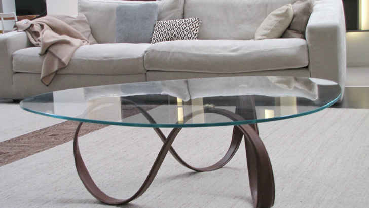
Glass furniture was definitely something that was more popular in the ‘90s, and while it seems clean and versatile, it’s often the opposite. Glass easily shows off fingerprints and dust, and oftentimes the trimming is shiny and feels out of place if the other furniture isn’t also as modern. You’re better off sticking to wood or other more solid styles of furnishings.
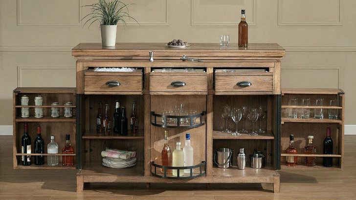
Liquor Cabinet/Shot Shelf
ADVERTISEMENT - CONTINUE BELOW
We get it, you’ve been to a lot of places, but as if collecting touristy shot glasses isn’t tacky enough, using them as a focal point of your room is the next level. Keep your drinkware and alcohol out of your living room, as it shows you’re a bit too enthusiastic about partying, and could give the wrong impression of your personality.
Excessive Pillows

ADVERTISEMENT - CONTINUE BELOW
Some people will try and tell you there’s no such thing as too many pillows, but those individuals are wrong. If people want to sit on your couch, you shouldn’t have to discard a ton of pillows to make room, and it’s an added problem to need somewhere to put them. Keep it simple with a limited amount of functional pillows, and you’ll save yourself the headache.
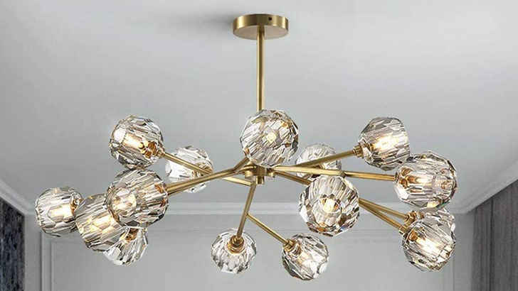
Golden Fixtures
ADVERTISEMENT - CONTINUE BELOW
Much like glass furniture, gold trimmings on various fixtures around your living room pose immediate problems for the eye, creating mismatched accents when gold isn’t an official color of the room’s theme. Gold now looks outdated in comparison to modern decor trends, so in efforts not to date yourself, avoid these older items in your most forward-thinking room.
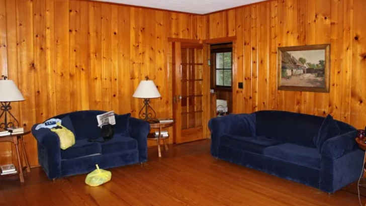
Wood Panelling
ADVERTISEMENT - CONTINUE BELOW
Wood belongs on floors, but not so much on the walls. Paneling like this is sure to make your room look outdated by at least 30 years, and again, though the cabin-like rustic feel may seem good in theory, it just looks played out and darkens your room. Don’t force yourself into a wood aesthetic unless you’re in the right rural area for it.
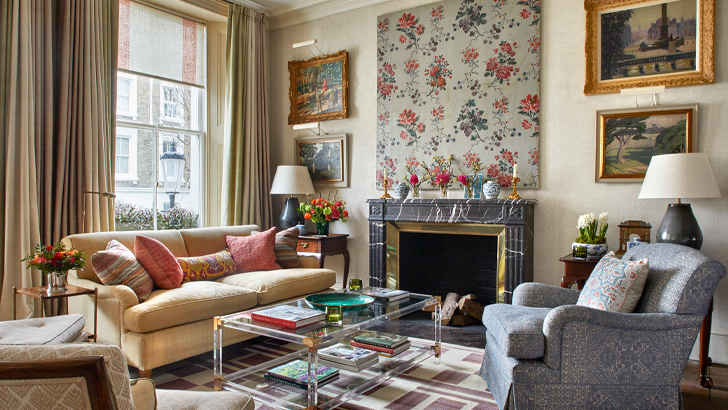
Mismatched Patterns
ADVERTISEMENT - CONTINUE BELOW
You see this one all the time. Striped pillows on patterned couches. Bright, geometric rugs in brick rooms. Wild blankets and oddly colored curtains. Stick to clean, simple patterns and only 2-3 subtle colors to really make your room pop, because the more busy it gets, the more distressing it will be to even be in it.
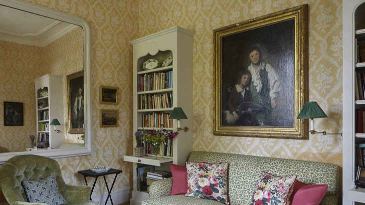
Weird Wallpaper
ADVERTISEMENT - CONTINUE BELOW
In general, wallpaper has really become an obsolete feature to almost any room in any house, but boy does it look suspect when it’s in the living room. This shows you don’t care much to update your house to the latest styles, and probably gives guests the idea that you’re oblivious to how cheesy it makes a room feel. Don’t age yourself so easily.
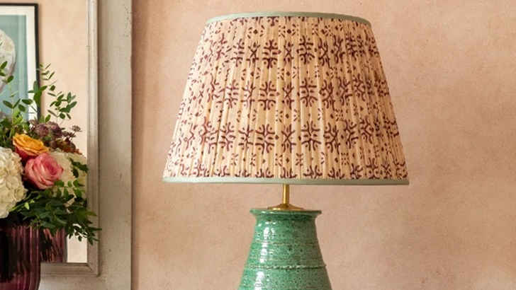
Strange Lampshades
ADVERTISEMENT - CONTINUE BELOW
If you happen to travel to Turkey and are thinking about purchasing a uniquely patterned lampshade to give your room some pop, do yourself a favor and don’t. Not only is this going to be completely out of place in comparison to the rest of your stuff, but it’s also sort of obnoxious. Not worth the conversation starter.
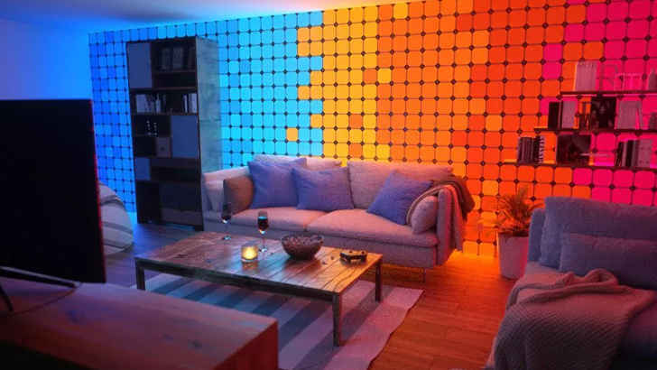
Color-Changing Lights
ADVERTISEMENT - CONTINUE BELOW
Sure, we hear you – you want to fit in with your millennial children or just want to give your living room a more club-like vibe. Well, not sure it’s the best idea, aesthetically or for your electric bill. It feels pretty daunting if your room is constantly changing, mostly because it can become emotionally draining. Having to adjust to changing light isn’t very comforting for visitors.
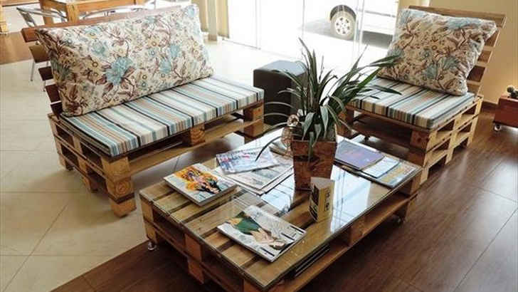
Pallet Furniture
ADVERTISEMENT - CONTINUE BELOW
Again with the bucolic furnishings. They just don’t give you the character you think you’re achieving, and a problematic consequence is also how easily they stain, considering they’re just refined wood. Save yourself the assimilation process and make sure you keep a more consistent theme rather than drawing focus to a table.
Plastic Storage
ADVERTISEMENT - CONTINUE BELOW
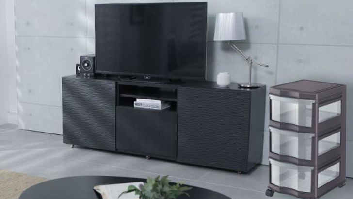
Nothing shows your living room is in limbo like having cheap plastic storage with assorted items in it around the walls. Either it shows you’re unable to get organized, or a hoarder, neither of which you really want. It surely looks tacky, and shows you’re improvising as you go rather than decorating the room to your preference.
Frameless Posters
ADVERTISEMENT - CONTINUE BELOW
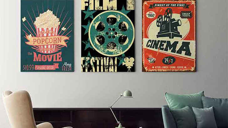
Posters can be a great addition to any living room, as they can provide a variety of different feels whether it be artful, or more pop culture focused like movies or band posters. However, if you can’t frame these, they tend to look half as good, and ultimately make it look like you just threw something up to fill the space.
Cheesy Frames
ADVERTISEMENT - CONTINUE BELOW
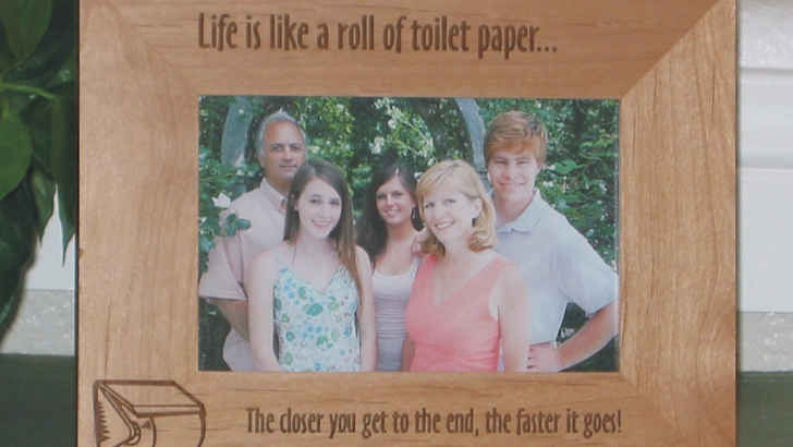
We all love seeing your smiling family on the bookshelf or in some nice frames around the living room, but the moment you stick them in a “Rather be Fishing” or “Got it from my Momma” frame, you’re losing the appeal of the picture and drawing attention to a cliche phrase. Just let the picture speak for itself in a clean frame.
Matching Pillows
ADVERTISEMENT - CONTINUE BELOW
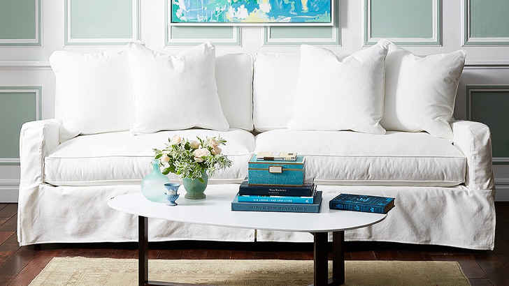
Something that may not seem like a big deal at first, but you’ll probably regret later is matching your pillows to your couch. You’d think it looks seamless, but it actually makes the couch look chunkier, and prevents you from having a contrast that could compliment your room. Try and have your pillows match your drapes or carpet with soft tones if possible.
Fake Wallpaper Backdrops
ADVERTISEMENT - CONTINUE BELOW
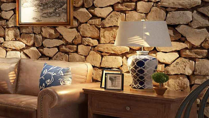
If you want something like a bookcase, stone or a scenic view from your home, we don’t recommend putting up fake wallpaper to achieve your dream. One of the tackiest things you can do is put wallpaper on an entire wall of an artificial look or scenario, because it’s so obvious it’s fake, it’s more puzzling than it is cool. Save yourself the embarrassment.
Chevrons
ADVERTISEMENT - CONTINUE BELOW
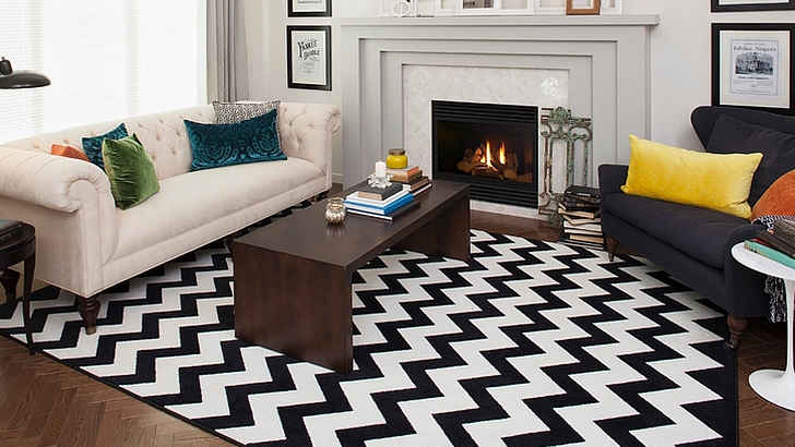
The Chevron style has overstayed its welcome, and it’s probably time you leave it behind rather than trying to make your living space feel like a ‘70s cafe. The black and white quirky pattern may have seemed posh or kitschy at some point, but we’ve come to the conclusion that it’s distracting and busy at the very least. Fad’s over.
Word Decals

ADVERTISEMENT - CONTINUE BELOW
Whatever you do, don’t post worded quotes on your wall for any reason, we’re begging you. Just because you supposedly live by a phrase doesn’t mean you or anyone else need to be reminded of it every time you step into the room. It’s very cheesy and sort of just insists you don’t really get interior design.
Wooden Animals
ADVERTISEMENT - CONTINUE BELOW
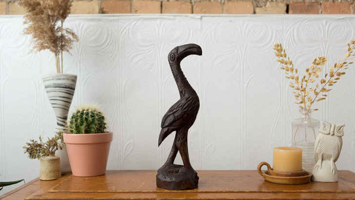
Like knick knacks, little wooden figures are cute and applicable in certain settings, but randomly placing wooden animals around the room to create a more outdoorsy vibe is just a bit too tacky for our liking. Figurines only take up space and collect dust, so don’t waste your floor or shelf space with things that serve no purpose.






![One of the most annoying parts about driving is parking, and even worse than parking, is being unable to get a spot because of someone else’s selfishness. For whatever reason, wherever you go, some people think they’re entitled to off-limits or excessive spots. [mw-nw group="atf-leaderboard-300x250-instream-1"]INSERT START SLIDE SHOW IMAGE[mw-nw group="300x250-instream-2"] But on the contrary, oftentimes when people park inconsideably, other good samaritans act, many times exposing and showcasing the person’s foolishness for all to see. These are some of the worst parking fails ever captured, and many of the hilarious retaliations they caused. Construction 101 [mw-nw group="atf-leaderboard-300x250-instream-1"][mw-nw group="300x250-instream-2"] As you can read on the plywood, “No parking means no parking.” Clearly this guy was sick of the smart car hogging up space every day, and let him have it by trapping him in a makeshift fence. Just Aggressive [mw-nw group="atf-leaderboard-300x250-instream-1"][mw-nw group="300x250-instream-2"] This entitled Mercedes driver decided to take up 5 spots in the middle of a busy lot, and the other patrons let him have it. Though they were aggressive, I’m sure the driver got the message. Sidewalk Criminal [mw-nw group="atf-leaderboard-300x250-instream-1"][mw-nw group="300x250-instream-2"] If there’s one rule when parking in a neighborhood driveway, it’s to never block the sidewalk traffic. Because if you do, they’ll not only be annoyed, but might even slide across your hood. Jeep Locked [mw-nw group="atf-leaderboard-300x250-instream-1"][mw-nw group="300x250-instream-2"] It’s not just trucks who take up unnecessary spots, Jeeps do it too. But this guy wasn’t getting away with it so easily, as the authorities decided to throw boots on the wheels so he couldn’t leave. Cart Swarm! [mw-nw group="atf-leaderboard-300x250-instream-1"][mw-nw group="300x250-instream-2"] Everyone knows that parking your car outside a department store is a no-no, and that’s because tons of people are trying to get in and out. Well, the cart retriever sure showed them! Giving Them the Boot [mw-nw group="atf-leaderboard-300x250-instream-1"][mw-nw group="300x250-instream-2"] If you’re bold enough to show disregard for others and take up multiple spots outside a busy store, you should be fully prepared to suffer the consequences when people complain! Special Spot [mw-nw group="atf-leaderboard-300x250-instream-1"][mw-nw group="300x250-instream-2"] Since this fellow didn’t seem to care about the lines purposely signifying parking spaces, a nice patron decided to draw them their own spot, since they couldn’t park in one themself. Passenger Door [mw-nw group="atf-leaderboard-300x250-instream-1"][mw-nw group="300x250-instream-2"] Since this Camaro decided to get cute and park in the dead center of two spots, the driver of this Rav-4 must have been livid to see there were no others available, so he immediately made his frustration known. Time to hop over the center console! Trashed In [mw-nw group="atf-leaderboard-300x250-instream-1"][mw-nw group="300x250-instream-2"] Usually in the city, when they say no parking, they really mean it. Not only was it clearly displayed on these dumpsters, but what better way to emphasize the point than by pinning them in with said dumpsters. Hydrant Priority [mw-nw group="atf-leaderboard-300x250-instream-1"][mw-nw group="300x250-instream-2"] Everyone should know that you’re not supposed to block fire hydrants, and while city’s always block a spot off, some people still disrespect their wishes. And when it comes to safety, the hydrant is always going to take priority over the car. You’re Surrounded [mw-nw group="atf-leaderboard-300x250-instream-1"][mw-nw group="300x250-instream-2"] When this person thought he was smart by parking whimsically in an open lot, some others decided play a nice little prank on them, surrounding with five vehicles, making it almost impossible to escape. Grumpy Notice [mw-nw group="atf-leaderboard-300x250-instream-1"][mw-nw group="300x250-instream-2"] When you have a reserved spot, you treat it like your baby. And that was certainly the case for this person, who used this grumpy cat notice to get the message across. Betting there won’t be a next time! Drive Away [mw-nw group="atf-leaderboard-300x250-instream-1"][mw-nw group="300x250-instream-2"] This person took issue when his neighbor literally parked in the way of their driveway, causing them to be trapped due to the curbing. They made their frustrations heard with a nice illustration. Going Online [mw-nw group="atf-leaderboard-300x250-instream-1"][mw-nw group="300x250-instream-2"] If you’re especially bad at parking, you’re probably going to end up on the internet in a story like this, being exposed for your incapabilities. This annoyed neighbor was sure to make that known. Going down! [mw-nw group="atf-leaderboard-300x250-instream-1"][mw-nw group="300x250-instream-2"] When people are fed up, they tend to make some pretty ambitious threats, but somehow when it comes to parking, people get really riled up. Though this would be a crime, still not worth risking it! Parking Consumption [mw-nw group="atf-leaderboard-300x250-instream-1"][mw-nw group="300x250-instream-2"] Of all the notes you could leave on a napkin, this is probably one of the nicest. You can’t say that they aren’t speaking the truth, and all humans should help lowering parking consumption. Art Notice [mw-nw group="atf-leaderboard-300x250-instream-1"][mw-nw group="300x250-instream-2"] The passive aggressive nature of taking even a little time to draw a picture, just to prove how annoyed you are with the person who took your spot is admirable. Have to respect the effort. Hopefully they get the message. Squeezed Outback [mw-nw group="atf-leaderboard-300x250-instream-1"][mw-nw group="300x250-instream-2"] When this Ford Explorer decided to park across multiple parking spots for no apparent reason, two other people took it upon themselves to pin them in incredibly tight, giving the perpetrator low chances of escaping. Still Fits [mw-nw group="atf-leaderboard-300x250-instream-1"][mw-nw group="300x250-instream-2"] Even though this person’s selfish effort to take up two spots was egregious, this Jeep Wrangler was still able to fit in one of them, allowing him to make the driver’s door completely inaccessible. Make ‘em work for it. Exposed [mw-nw group="atf-leaderboard-300x250-instream-1"][mw-nw group="300x250-instream-2"] Sometimes when you clearly display that you don’t know where the spot is, other people are willing to help point it out, in dramatic fashion. Now everyone knows how entitled they were. Saran Stuck [mw-nw group="atf-leaderboard-300x250-instream-1"][mw-nw group="300x250-instream-2"] Everyone knows the classic saran wrap car prank, but this person took it to another level. It looks as if they wrapped it multiple times, considering you can’t even see in the windows. Good luck getting that off. Potato Clan [mw-nw group="atf-leaderboard-300x250-instream-1"][mw-nw group="300x250-instream-2"] Welp, well this unlucky individual couldn’t have predicted the Potato Clan would come after him, but they better shape up before the rest of whatever the produce army comes for them... Princess Parking [mw-nw group="atf-leaderboard-300x250-instream-1"][mw-nw group="300x250-instream-2"] They teach you pretty early on that anything with stripes slashed across is a no parking zone, but some people try and just do it anyway. And even if you don’t get a ticket, someone will call you out for what you are. Stoned [mw-nw group="atf-leaderboard-300x250-instream-1"][mw-nw group="300x250-instream-2"] Instead of putting a boot on this car, it seems an unhappy patron decided to really take it to the extreme and just drop a whole slab of rock on the hood. Regardless of if it proved his point, we’re sure it left a mark. Line Crosser [mw-nw group="atf-leaderboard-300x250-instream-1"][mw-nw group="300x250-instream-2"] The only excuse this person could have is that the spots were snowed over when they got there, which would be benefit of the doubt, but considering someone likely had to park far away and was mad enough to write it, probably not. Good Luck [mw-nw group="atf-leaderboard-300x250-instream-1"][mw-nw group="300x250-instream-2"] Since this individual didn’t understand how to stay in his own parallel spot, the people who were forced out of space decided to make a point by pinning them in so closely, he’ll inevitably have to face the music. Today’s Winner [mw-nw group="atf-leaderboard-300x250-instream-1"][mw-nw group="300x250-instream-2"] Instead of the typical passive aggressive response to bad parking, this person decided to glorify this offender for the entire parking garage to see. Can’t imagine they’ll make that mistake again, but now everyone knows their true colors. Thorough Explanation [mw-nw group="atf-leaderboard-300x250-instream-1"][mw-nw group="300x250-instream-2"] Somebody obviously bought this card in anticipation of meeting yet another incapable parker, which has probably been torturing them for years. Now, at least the culprit will know the extent of their actions. Smart Chains While this may be extremely petty, this improvisation tire chain lock system is absolutely savage. Not that everyone just has a massive chain handy, but this was bound to dumbfound the driver. Perpendicular No one will ever understand why you’d think it’s okay to just park sideways across multiple spots, but you better believe that if you don’t have an extremely good reason, people are going to come for you. Propped Up Clearly this isn’t how these cars are usually parked in the driveway, and we can assume the Mazda came in a bit too hot, to the point where both cars were not only lifted, but got wedged in place. Trashed This person was practically asking for it when he decided to park inappropriately next to some dumpsters of all places. Even we could’ve predicted that angry patrons would show them up in the most obvious way. On An Island This historical picture of a man’s truck being isolated by an entire trench is pretty epic, and makes you wonder how long it’d been there, and whether or not the driver was ever coming back. Insert Text Nikhail It’s unclear what the story behind the costumes is, but it’s pretty obvious these three men decided to troll whoever it is that decided to park perfectly on top of the dividing line. Hummer Duel Nothing like two Hummers duking it out for spots that are already too small for the monstrosity of vehicles they are. Clearly one got to the spot the other wanted first, so they cancelled out each other’s driver-side door. Handicapped Forever When this person decided to risk it all for a handicapped spot, they never could have predicted the consequences would be taken this far. That blue paint sure isn’t coming off easily. Carted In A benefit of the other inconsiderate people who leave carts outside of the corral is that you can use them to trap in other inconsiderate folks who take up multiple spots at the grocery store. Good going team! Rude Imposter Not only did this guy park in a foolish manner and take up two spots, but he did it in the exact same make and model as another jeep, who clearly took offense. He responded appropriately, though, by just perching himself on the person’s wheel. Be Careful Whether they knew it or not, this car was parked on private property, and even though it usually just sounds like a threat, this time the owner was very serious. Now it’s time to figure out how to get the car down... Seriously, How? Well, now we can see the extent of the situation. It appears that the car was raised up by the forklift, and will likely stay on the cage until the owner comes back and learns what he’s done. Dare You This smaller vehicle was so over the fact this lifted pickup truck felt the need to take up two spots, they literally parked underneath the body, effectively daring them to run them over if they want to leave before them. Lambo Boot Just because you’re rich or drive a nice car, doesn’t mean you’re immune from the rule of law, let alone basic street rules. This Lamborghini tried to get cute and park in a loading zone, but authorities weren’t having it. Cart Prison Whatever this person did, it wasn’t parking outside the lines, because the car appears to be in the spot. We’ll guess this car had been left way past its welcome, so the store made an emphasis to make sure it wouldn't leave without an explanation. Smart Tips The car with the least excuse of fitting in a normal spot would be a smart car, so when this driver made the mistake of parking directly on the line, the people let him have it and tipped the whole car over. Ruthless. Yellow Stripe To showcase exactly how bad this person’s parking efforts were, they visualized it for them with a yellow line of their own, appropriately striped across the whole car, which was sure to infuriate the perpetrator. Blatant Disrespect Either the driver of that Ford couldn’t read, or had a gripe with the motorcycle driver, because pinning a motorcycle in when it’s in its designated spot is not cool. Hopefully they were still able to get out. [mw-nw group="end-of-gallery"]](https://staging.bonvoyaged.com/wp-content/uploads/2014/06/awfulparkingfeaturedimage-400x240.jpg)
![One of the most annoying parts about driving is parking, and even worse than parking, is being unable to get a spot because of someone else’s selfishness. For whatever reason, wherever you go, some people think they’re entitled to off-limits or excessive spots. [mw-nw group="atf-leaderboard-300x250-instream-1"]INSERT START SLIDE SHOW IMAGE[mw-nw group="300x250-instream-2"] But on the contrary, oftentimes when people park inconsideably, other good samaritans act, many times exposing and showcasing the person’s foolishness for all to see. These are some of the worst parking fails ever captured, and many of the hilarious retaliations they caused. Construction 101 [mw-nw group="atf-leaderboard-300x250-instream-1"][mw-nw group="300x250-instream-2"] As you can read on the plywood, “No parking means no parking.” Clearly this guy was sick of the smart car hogging up space every day, and let him have it by trapping him in a makeshift fence. Just Aggressive [mw-nw group="atf-leaderboard-300x250-instream-1"][mw-nw group="300x250-instream-2"] This entitled Mercedes driver decided to take up 5 spots in the middle of a busy lot, and the other patrons let him have it. Though they were aggressive, I’m sure the driver got the message. Sidewalk Criminal [mw-nw group="atf-leaderboard-300x250-instream-1"][mw-nw group="300x250-instream-2"] If there’s one rule when parking in a neighborhood driveway, it’s to never block the sidewalk traffic. Because if you do, they’ll not only be annoyed, but might even slide across your hood. Jeep Locked [mw-nw group="atf-leaderboard-300x250-instream-1"][mw-nw group="300x250-instream-2"] It’s not just trucks who take up unnecessary spots, Jeeps do it too. But this guy wasn’t getting away with it so easily, as the authorities decided to throw boots on the wheels so he couldn’t leave. Cart Swarm! [mw-nw group="atf-leaderboard-300x250-instream-1"][mw-nw group="300x250-instream-2"] Everyone knows that parking your car outside a department store is a no-no, and that’s because tons of people are trying to get in and out. Well, the cart retriever sure showed them! Giving Them the Boot [mw-nw group="atf-leaderboard-300x250-instream-1"][mw-nw group="300x250-instream-2"] If you’re bold enough to show disregard for others and take up multiple spots outside a busy store, you should be fully prepared to suffer the consequences when people complain! Special Spot [mw-nw group="atf-leaderboard-300x250-instream-1"][mw-nw group="300x250-instream-2"] Since this fellow didn’t seem to care about the lines purposely signifying parking spaces, a nice patron decided to draw them their own spot, since they couldn’t park in one themself. Passenger Door [mw-nw group="atf-leaderboard-300x250-instream-1"][mw-nw group="300x250-instream-2"] Since this Camaro decided to get cute and park in the dead center of two spots, the driver of this Rav-4 must have been livid to see there were no others available, so he immediately made his frustration known. Time to hop over the center console! Trashed In [mw-nw group="atf-leaderboard-300x250-instream-1"][mw-nw group="300x250-instream-2"] Usually in the city, when they say no parking, they really mean it. Not only was it clearly displayed on these dumpsters, but what better way to emphasize the point than by pinning them in with said dumpsters. Hydrant Priority [mw-nw group="atf-leaderboard-300x250-instream-1"][mw-nw group="300x250-instream-2"] Everyone should know that you’re not supposed to block fire hydrants, and while city’s always block a spot off, some people still disrespect their wishes. And when it comes to safety, the hydrant is always going to take priority over the car. You’re Surrounded [mw-nw group="atf-leaderboard-300x250-instream-1"][mw-nw group="300x250-instream-2"] When this person thought he was smart by parking whimsically in an open lot, some others decided play a nice little prank on them, surrounding with five vehicles, making it almost impossible to escape. Grumpy Notice [mw-nw group="atf-leaderboard-300x250-instream-1"][mw-nw group="300x250-instream-2"] When you have a reserved spot, you treat it like your baby. And that was certainly the case for this person, who used this grumpy cat notice to get the message across. Betting there won’t be a next time! Drive Away [mw-nw group="atf-leaderboard-300x250-instream-1"][mw-nw group="300x250-instream-2"] This person took issue when his neighbor literally parked in the way of their driveway, causing them to be trapped due to the curbing. They made their frustrations heard with a nice illustration. Going Online [mw-nw group="atf-leaderboard-300x250-instream-1"][mw-nw group="300x250-instream-2"] If you’re especially bad at parking, you’re probably going to end up on the internet in a story like this, being exposed for your incapabilities. This annoyed neighbor was sure to make that known. Going down! [mw-nw group="atf-leaderboard-300x250-instream-1"][mw-nw group="300x250-instream-2"] When people are fed up, they tend to make some pretty ambitious threats, but somehow when it comes to parking, people get really riled up. Though this would be a crime, still not worth risking it! Parking Consumption [mw-nw group="atf-leaderboard-300x250-instream-1"][mw-nw group="300x250-instream-2"] Of all the notes you could leave on a napkin, this is probably one of the nicest. You can’t say that they aren’t speaking the truth, and all humans should help lowering parking consumption. Art Notice [mw-nw group="atf-leaderboard-300x250-instream-1"][mw-nw group="300x250-instream-2"] The passive aggressive nature of taking even a little time to draw a picture, just to prove how annoyed you are with the person who took your spot is admirable. Have to respect the effort. Hopefully they get the message. Squeezed Outback [mw-nw group="atf-leaderboard-300x250-instream-1"][mw-nw group="300x250-instream-2"] When this Ford Explorer decided to park across multiple parking spots for no apparent reason, two other people took it upon themselves to pin them in incredibly tight, giving the perpetrator low chances of escaping. Still Fits [mw-nw group="atf-leaderboard-300x250-instream-1"][mw-nw group="300x250-instream-2"] Even though this person’s selfish effort to take up two spots was egregious, this Jeep Wrangler was still able to fit in one of them, allowing him to make the driver’s door completely inaccessible. Make ‘em work for it. Exposed [mw-nw group="atf-leaderboard-300x250-instream-1"][mw-nw group="300x250-instream-2"] Sometimes when you clearly display that you don’t know where the spot is, other people are willing to help point it out, in dramatic fashion. Now everyone knows how entitled they were. Saran Stuck [mw-nw group="atf-leaderboard-300x250-instream-1"][mw-nw group="300x250-instream-2"] Everyone knows the classic saran wrap car prank, but this person took it to another level. It looks as if they wrapped it multiple times, considering you can’t even see in the windows. Good luck getting that off. Potato Clan [mw-nw group="atf-leaderboard-300x250-instream-1"][mw-nw group="300x250-instream-2"] Welp, well this unlucky individual couldn’t have predicted the Potato Clan would come after him, but they better shape up before the rest of whatever the produce army comes for them... Princess Parking [mw-nw group="atf-leaderboard-300x250-instream-1"][mw-nw group="300x250-instream-2"] They teach you pretty early on that anything with stripes slashed across is a no parking zone, but some people try and just do it anyway. And even if you don’t get a ticket, someone will call you out for what you are. Stoned [mw-nw group="atf-leaderboard-300x250-instream-1"][mw-nw group="300x250-instream-2"] Instead of putting a boot on this car, it seems an unhappy patron decided to really take it to the extreme and just drop a whole slab of rock on the hood. Regardless of if it proved his point, we’re sure it left a mark. Line Crosser [mw-nw group="atf-leaderboard-300x250-instream-1"][mw-nw group="300x250-instream-2"] The only excuse this person could have is that the spots were snowed over when they got there, which would be benefit of the doubt, but considering someone likely had to park far away and was mad enough to write it, probably not. Good Luck [mw-nw group="atf-leaderboard-300x250-instream-1"][mw-nw group="300x250-instream-2"] Since this individual didn’t understand how to stay in his own parallel spot, the people who were forced out of space decided to make a point by pinning them in so closely, he’ll inevitably have to face the music. Today’s Winner [mw-nw group="atf-leaderboard-300x250-instream-1"][mw-nw group="300x250-instream-2"] Instead of the typical passive aggressive response to bad parking, this person decided to glorify this offender for the entire parking garage to see. Can’t imagine they’ll make that mistake again, but now everyone knows their true colors. Thorough Explanation [mw-nw group="atf-leaderboard-300x250-instream-1"][mw-nw group="300x250-instream-2"] Somebody obviously bought this card in anticipation of meeting yet another incapable parker, which has probably been torturing them for years. Now, at least the culprit will know the extent of their actions. Smart Chains While this may be extremely petty, this improvisation tire chain lock system is absolutely savage. Not that everyone just has a massive chain handy, but this was bound to dumbfound the driver. Perpendicular No one will ever understand why you’d think it’s okay to just park sideways across multiple spots, but you better believe that if you don’t have an extremely good reason, people are going to come for you. Propped Up Clearly this isn’t how these cars are usually parked in the driveway, and we can assume the Mazda came in a bit too hot, to the point where both cars were not only lifted, but got wedged in place. Trashed This person was practically asking for it when he decided to park inappropriately next to some dumpsters of all places. Even we could’ve predicted that angry patrons would show them up in the most obvious way. On An Island This historical picture of a man’s truck being isolated by an entire trench is pretty epic, and makes you wonder how long it’d been there, and whether or not the driver was ever coming back. Insert Text Nikhail It’s unclear what the story behind the costumes is, but it’s pretty obvious these three men decided to troll whoever it is that decided to park perfectly on top of the dividing line. Hummer Duel Nothing like two Hummers duking it out for spots that are already too small for the monstrosity of vehicles they are. Clearly one got to the spot the other wanted first, so they cancelled out each other’s driver-side door. Handicapped Forever When this person decided to risk it all for a handicapped spot, they never could have predicted the consequences would be taken this far. That blue paint sure isn’t coming off easily. Carted In A benefit of the other inconsiderate people who leave carts outside of the corral is that you can use them to trap in other inconsiderate folks who take up multiple spots at the grocery store. Good going team! Rude Imposter Not only did this guy park in a foolish manner and take up two spots, but he did it in the exact same make and model as another jeep, who clearly took offense. He responded appropriately, though, by just perching himself on the person’s wheel. Be Careful Whether they knew it or not, this car was parked on private property, and even though it usually just sounds like a threat, this time the owner was very serious. Now it’s time to figure out how to get the car down... Seriously, How? Well, now we can see the extent of the situation. It appears that the car was raised up by the forklift, and will likely stay on the cage until the owner comes back and learns what he’s done. Dare You This smaller vehicle was so over the fact this lifted pickup truck felt the need to take up two spots, they literally parked underneath the body, effectively daring them to run them over if they want to leave before them. Lambo Boot Just because you’re rich or drive a nice car, doesn’t mean you’re immune from the rule of law, let alone basic street rules. This Lamborghini tried to get cute and park in a loading zone, but authorities weren’t having it. Cart Prison Whatever this person did, it wasn’t parking outside the lines, because the car appears to be in the spot. We’ll guess this car had been left way past its welcome, so the store made an emphasis to make sure it wouldn't leave without an explanation. Smart Tips The car with the least excuse of fitting in a normal spot would be a smart car, so when this driver made the mistake of parking directly on the line, the people let him have it and tipped the whole car over. Ruthless. Yellow Stripe To showcase exactly how bad this person’s parking efforts were, they visualized it for them with a yellow line of their own, appropriately striped across the whole car, which was sure to infuriate the perpetrator. Blatant Disrespect Either the driver of that Ford couldn’t read, or had a gripe with the motorcycle driver, because pinning a motorcycle in when it’s in its designated spot is not cool. Hopefully they were still able to get out. [mw-nw group="end-of-gallery"]](https://staging.bonvoyaged.com/wp-content/uploads/2014/06/awfulparkingfeaturedimage-100x100.jpg)


